Home Solutions
Product Design
8 Weeks
Figma, Figjam
Home Solutions' website was bloated and confusing—even job candidates couldn't figure out what the company did. Our 3-person design team led a content-first redesign that consolidated pages, clarified messaging, and created a cohesive visual identity—transforming the site into a tool that clearly communicates the company's value to investors, partners, and job seekers.
Product designer on a 3-person team responsible for user research, site architecture restructuring, brand identity development, and UX/UI design across multiple pages.


A bloated, confusing website made it difficult for investors, partners, and job candidates to understand what the company did or how to engage with it.
A rebrand and site restructure that established a fresh visual identity and created distinct pathways for each audience to quickly understand the business and take action.
Interviews with team members revealed critical UX failures—job seekers couldn't locate applications and the site felt intentionally vague about company purpose
Identified opportunity between overly technical and generic competitor sites—potential to own a "sophisticated but approachable" position in the market
Facilitated onsite workshop to build content storyboards and identify key user journeys for investors, partners, and employees
Content Audit & Content Strategy Story Board
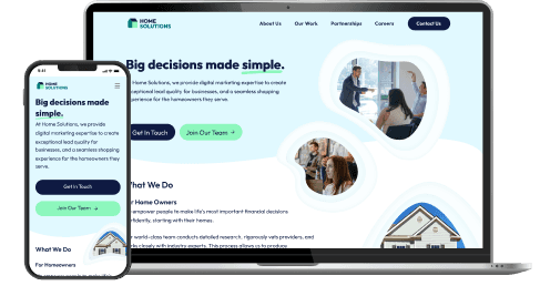
We approached this as a positioning problem, not just a visual refresh. We restructured the entire site around user needs, where the homepage became an elevator pitch with clear pathways for each audience. I helped develop the typography system, color palette, and visual motifs (including circular photo treatments and soft, organic shapes) that balance professionalism with approachability.
Brand positioning shift: Moved from vague inspirational language to benefit-driven messaging that immediately communicates value—homeowners get simplified decisions, providers get qualified leads
Audience-specific architecture: Created distinct pathways for service providers and job seekers—no more drilling through layers to find relevant information
Modern, accessible visual system: Established typography hierarchy, soft color palette (moving away from harsh primary colors), and circular imagery motifs that feel human and trustworthy
Mood Boards


Design System


Redesign | Mobile
Streamlined navigation by consolidating redundant pages
Created clear pathways for users to find relevant information
Established scalable visual system that balanced professionalism with approachability