Chord Health
Product Design
6 months
Figma
Chronic pain from musculoskeletal conditions severely disrupts patients' lives, creating a cycle where inactivity worsens symptoms. As the sole product designer at Chord Health, I designed a mobile app that helped patients understand and manage risk factors through step tracking and disease risk awareness. By making granular health data accessible and actionable, the app empowered patients to increase activity over time, improving mobility and decreasing chronic pain.
Sole product designer working directly with the CEO to expand the product from web to mobile. I led user research, information architecture, visual design, mockup iteration, and usability testing. Later transitioned to a customer-facing role to continue research and iterate on designs based on patient feedback.


Patients with chronic musculoskeletal pain needed accessible tools to understand how daily activity impacts their condition, but the company only offered web-based digital therapy.
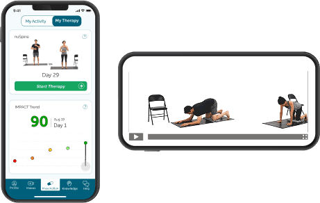
A mobile RPM app that tracks step counts and calculates individual pain risk scores, with post-launch iterations that improved accessibility for elderly users with visual impairments.
User Narrative
Dr. T is an interventional pain doctor in San Antonio. He helps many patients suffering from chronic pain. He recently learned about Chord Health’s Remote Patient Monitoring + Digital Therapy platform and heard that other providers have had positive experiences with it. He heard that Medicare is reimbursing for RPM and since ⅓ of his patients are on Medicare he thinks it would be of great benefit to both these patients and his practice.
To register, he has to enter his company name, tax ID number, first and last name, and work email. He receives an email verification and then has to create a password, agree to the Master Service Agreement, and then fill out the clinic name and address.
Next, there is a Billing Method screen, where Dr. T can choose how to get paid. His options are to select the “Medicare & Commercial Insurance” box, the “Self-Pay” box, or both. He selects both boxes and then has to fill out information in each box. In the “Medicare & Commercial Insurance” box, he has to enter his Medicare Provider Transaction Access Number (PTAN), individual National Provider Identifier Standard (NPI) and group NPI. In the “Self-Pay” box, he has to enter his bank account information.
Lastly, he is prompted to invite his team by entering their email addresses and roles.He adds his office manager Monica’s email so that she will also receive the alerts. Dr. T reaches the final screen in the registration process, which confirms that it is complete and has a video tutorial on how to create his first prescription.
I translated narratives into user stories and flows for both the provider web app and patient mobile experience. High-priority provider features included clinic registration with insurance billing setup, therapy prescription workflows, and reporting dashboards. Patient features centered on onboarding, risk score visualization, digital therapy content, and support access.
The mobile app's biggest design challenge was balancing two core features: digital physical therapy videos and step-tracking with risk scores. I went through multiple wireframe iterations exploring how to present both features. I believed they should be equally important, but as I moved into high-fidelity mockups, I positioned the physical therapy content more prominently while placing risk scores in a secondary tab.
Streamlined provider onboarding: Simplified complex insurance billing registration by mapping detailed workflows that accounted for Medicare reimbursement requirements
Comprehensive mobile onboarding: Designed full SMS-to-app flow including prescription text messages and download prompts to accurately represent the patient's first experience
New visual identity for mobile: Took the recently updated brand guidelines (previously used only in presentations) and created a cohesive design system for the mobile app
After the initial release, real-world usage revealed design flaws that hadn't matched my intentions—I had inadvertently deprioritized the risk awareness feature that was central to the product's value. The Risk Score Trend chart was buried in a secondary "My Activity" tab, requiring extra navigation. While I had conceptualized both features as equally important, my design choices positioned physical therapy as primary and risk scores as supplementary.
User feedback revealed critical usability issues. The graph's data points were designed to be tappable so patients could view daily details, but the dots were so small that accurate tapping was nearly impossible. This was particularly frustrating for our primary users—seniors with chronic pain, many with visual impairments.
I redesigned the dashboard to elevate risk scores to the main screen and added an interactive slider for graph navigation. Users could now scrub through dates without precise tap targeting.
Patient Onboarding User Flow

Clickable Prototype
Delivered complete design system for provider web app and patient mobile app (iOS and Android)
Created clickable prototypes simulating full user experience, including SMS onboarding flow
Conducted usability testing that validated onboarding process before development
Shipped initial app version, then iterated based on real patient feedback to improve accessibility