Chord Health helps patients with musculoskeletal conditions understand and manage risk factors for chronic pain through a mobile app.
Problem
Musculoskeletal conditions such as low back pain and osteoarthritis can severely disrupt a person’s life. Chronic pain impacts one’s ability to maintain an active lifestyle, which in turn perpetuates and exacerbates pain.
Solution
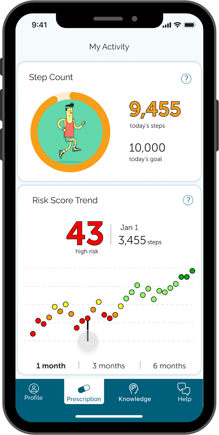
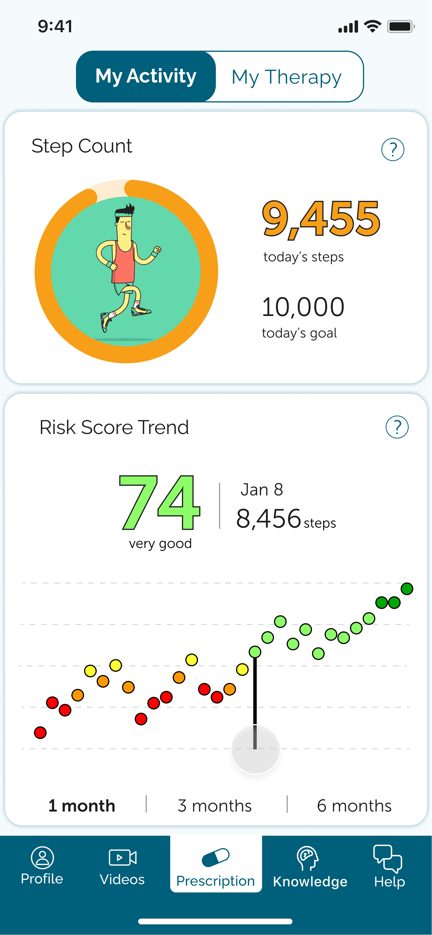
The Chord Health app collects step count data from a user’s smartphone and uses it to calculate an individual’s risk for chronic pain. Through awareness of risk, patients are able to increase their activity over time, which improves mobility and decreases risk for continued chronic pain.
Discovery
The process of designing this app involved a ton of brainstorming and work sessions up front to understand all of the intersecting touch points throughout each type of user’s experience. Myself and the CEO spent a great deal of time working together to create narratives that told the story of how providers would interact with patients and the various workflows that would need to be present in the app to support these narratives.
Strategy
User narratives
I used the results of our brainstorming work sessions to tell the stories of how various users would engage with the app, i.e. a narrative about a provider and his interactions with the provider web app, and another narrative for a Medicare patient and her interactions with the patient mobile app. These stories made it easy to spot holes in our thinking and restructure and solidify what was shaping up to be user story content.
Dr. T - RPM + Digital Therapy
Dr. T is an interventional pain doctor in San Antonio. He helps many patients suffering from chronic pain. He recently learned about Chord Health’s Remote Patient Monitoring + Digital Therapy platform and heard that other providers have had positive experiences with it. He heard that Medicare is reimbursing for RPM and since ⅓ of his patients are on Medicare he thinks it would be of great benefit to both these patients and his practice.
To register, he has to enter his company name, tax ID number, first and last name, and work email. He receives an email verification and then has to create a password, agree to the Master Service Agreement, and then fill out the clinic name and address.
Next, there is a Billing Method screen, where Dr. T can choose how to get paid. His options are to select the “Medicare & Commercial Insurance” box, the “Self-Pay” box, or both. He selects both boxes and then has to fill out information in each box. In the “Medicare & Commercial Insurance” box, he has to enter his Medicare Provider Transaction Access Number (PTAN), individual National Provider Identifier Standard (NPI) and group NPI. In the “Self-Pay” box, he has to enter his bank account information.
Lastly, he is prompted to invite his team by entering their email addresses and roles.He adds his office manager Monica’s email so that she will also receive the alerts. Dr. T reaches the final screen in the registration process, which confirms that it is complete and has a video tutorial on how to create his first prescription.
Information architecture
User flows
With user stories in mind, I created user flows for both the provider web app and the patient mobile and web app. The provider app flows included clinic registration, provider staff onboarding, bulk patient upload, and a large flow with day to day functions of the app. The patient facing flows included onboarding and a flow for each tab in the patient app. These provided even more insight than the narratives and user stories alone, making clear when there were gaps in our thinking and giving me a clearer picture of the design as I moved into wireframes. While some of the details changed as we learned more over time, these flows solidified the direction we were headed.
In the examples below, the highlighted steps mark changes to the existing product.
Wireframes
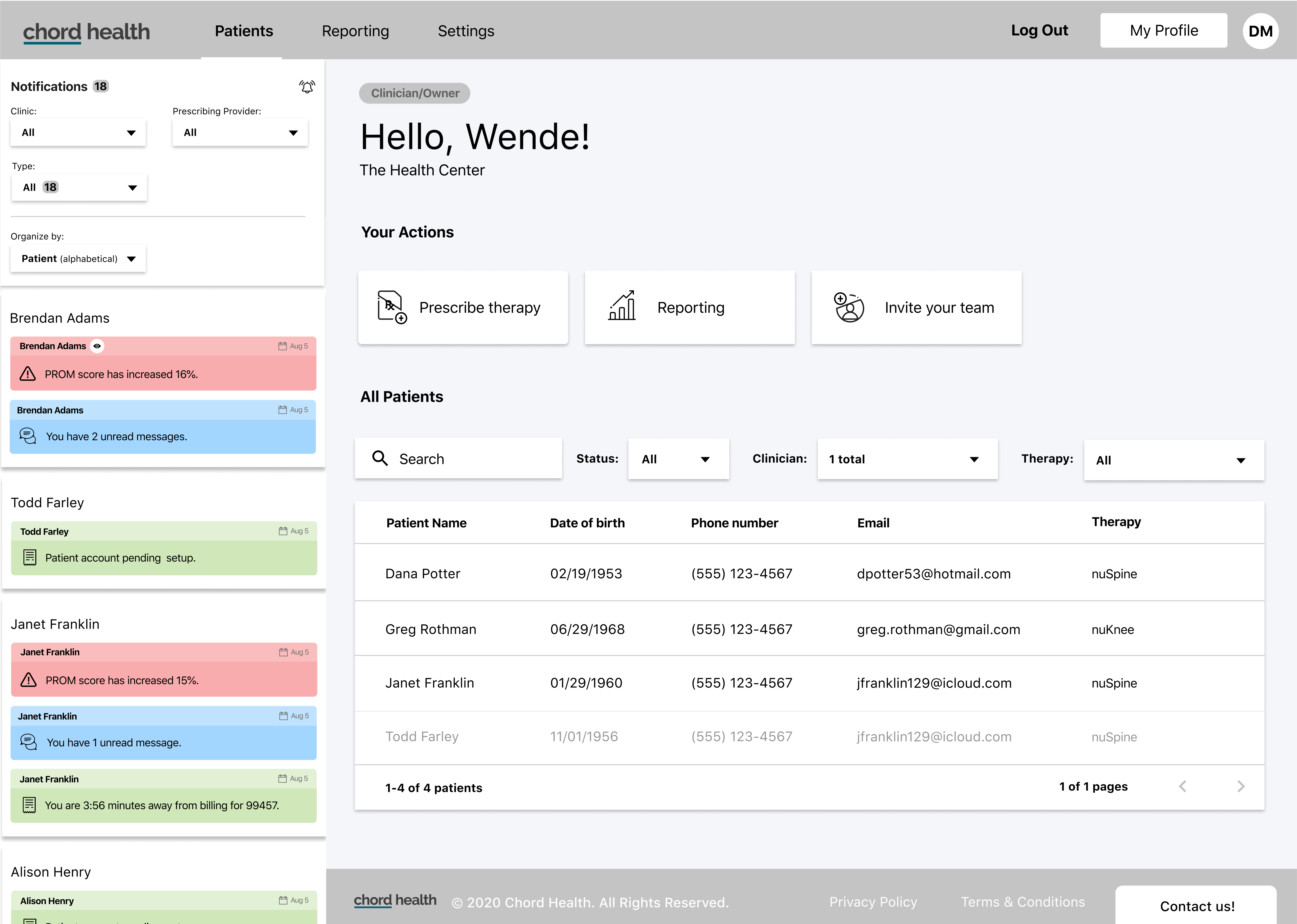
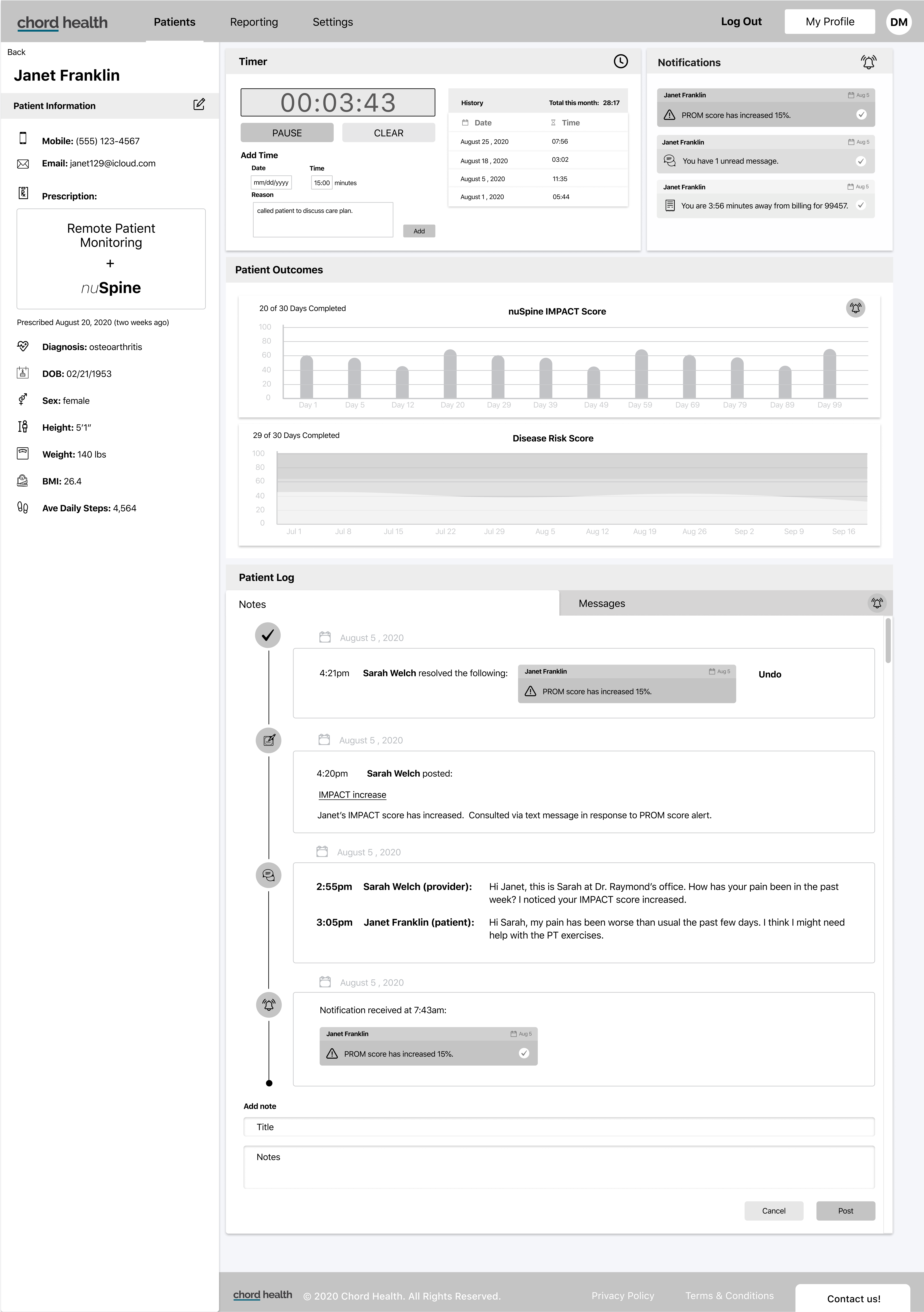
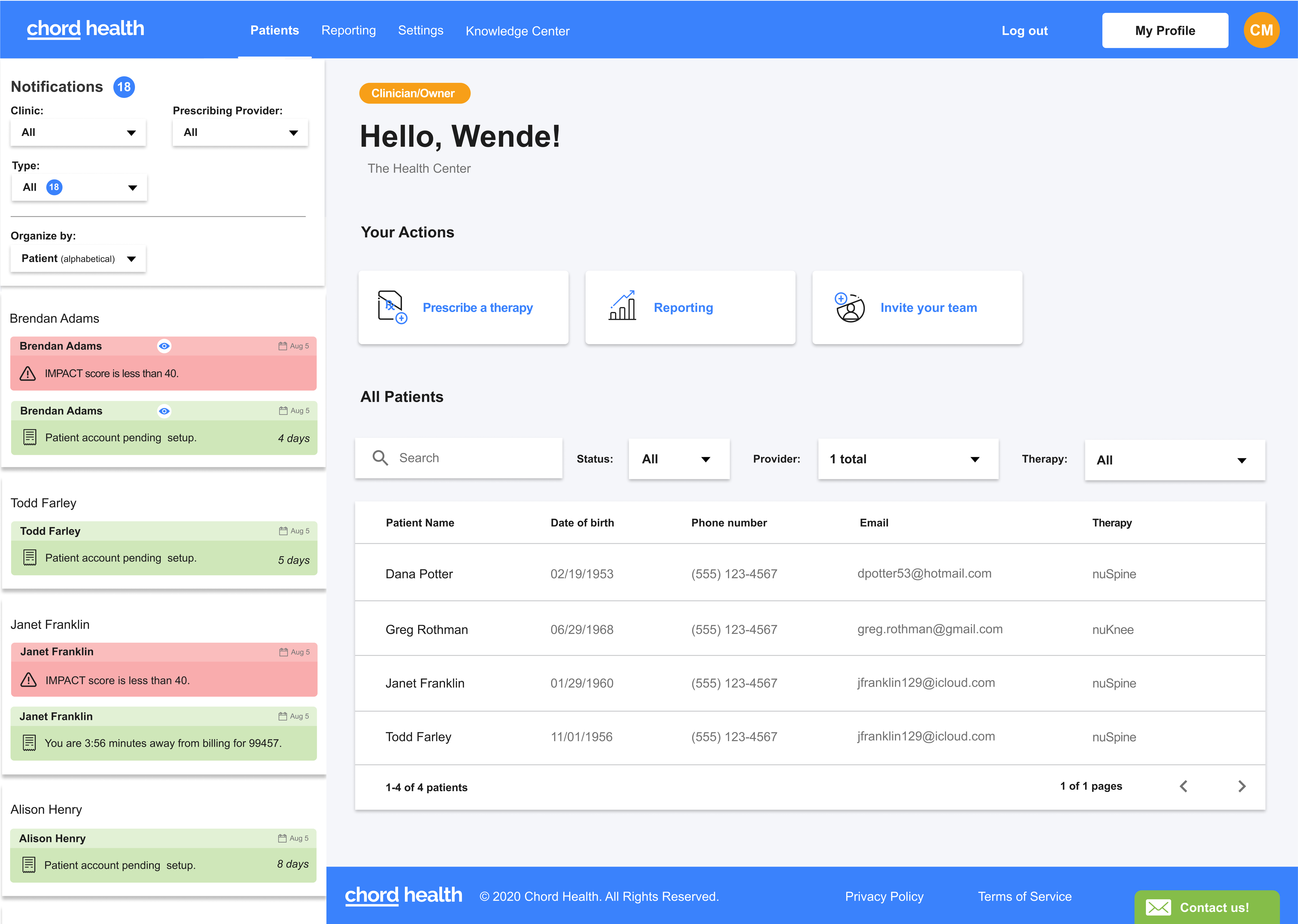
Using Figma I began translating the user flows into wireframes. For the provider web designs, I added new features such as the notifications side bar on the dashboard while keeping the basic UI elements that existed in the current provider-facing app.
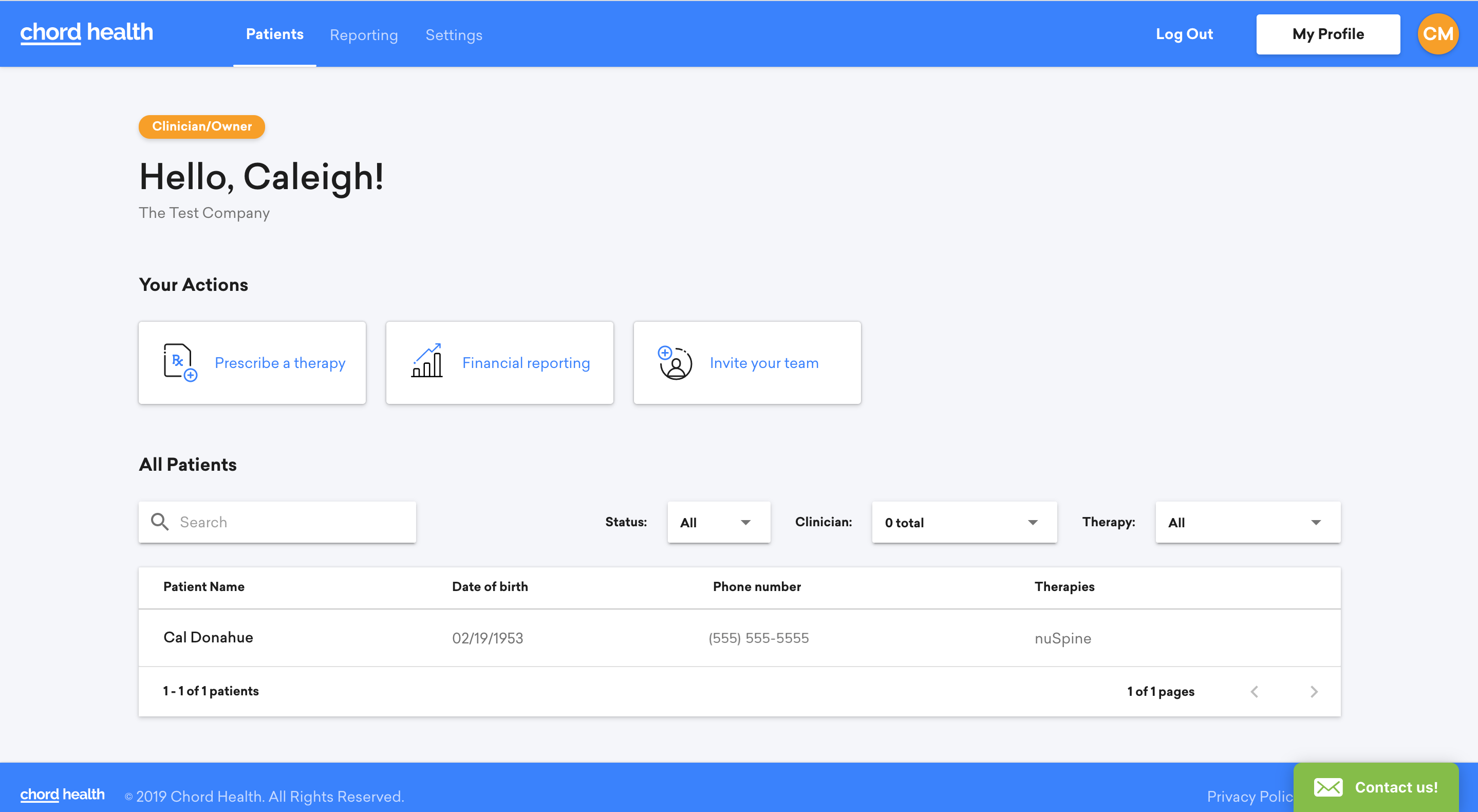
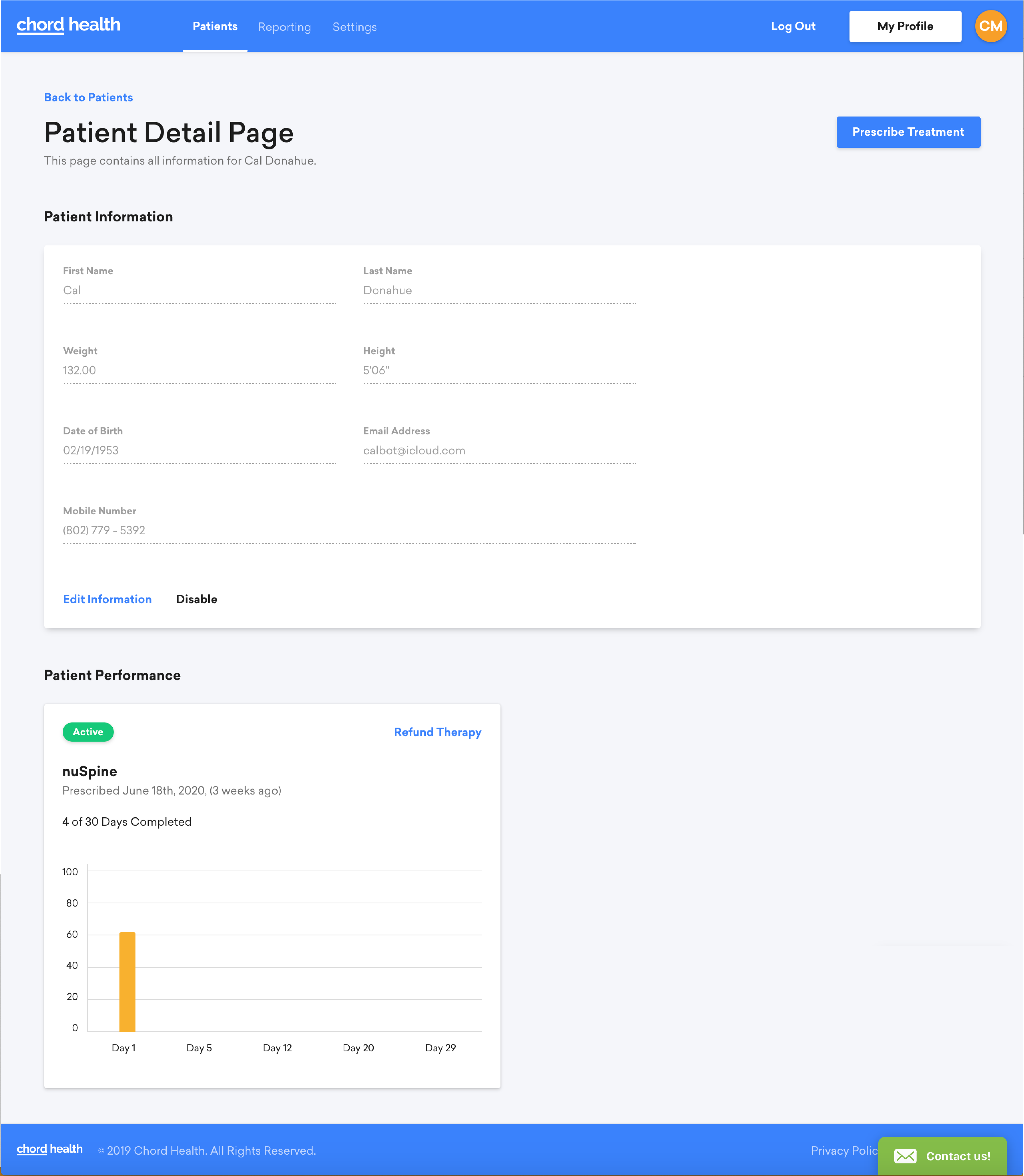
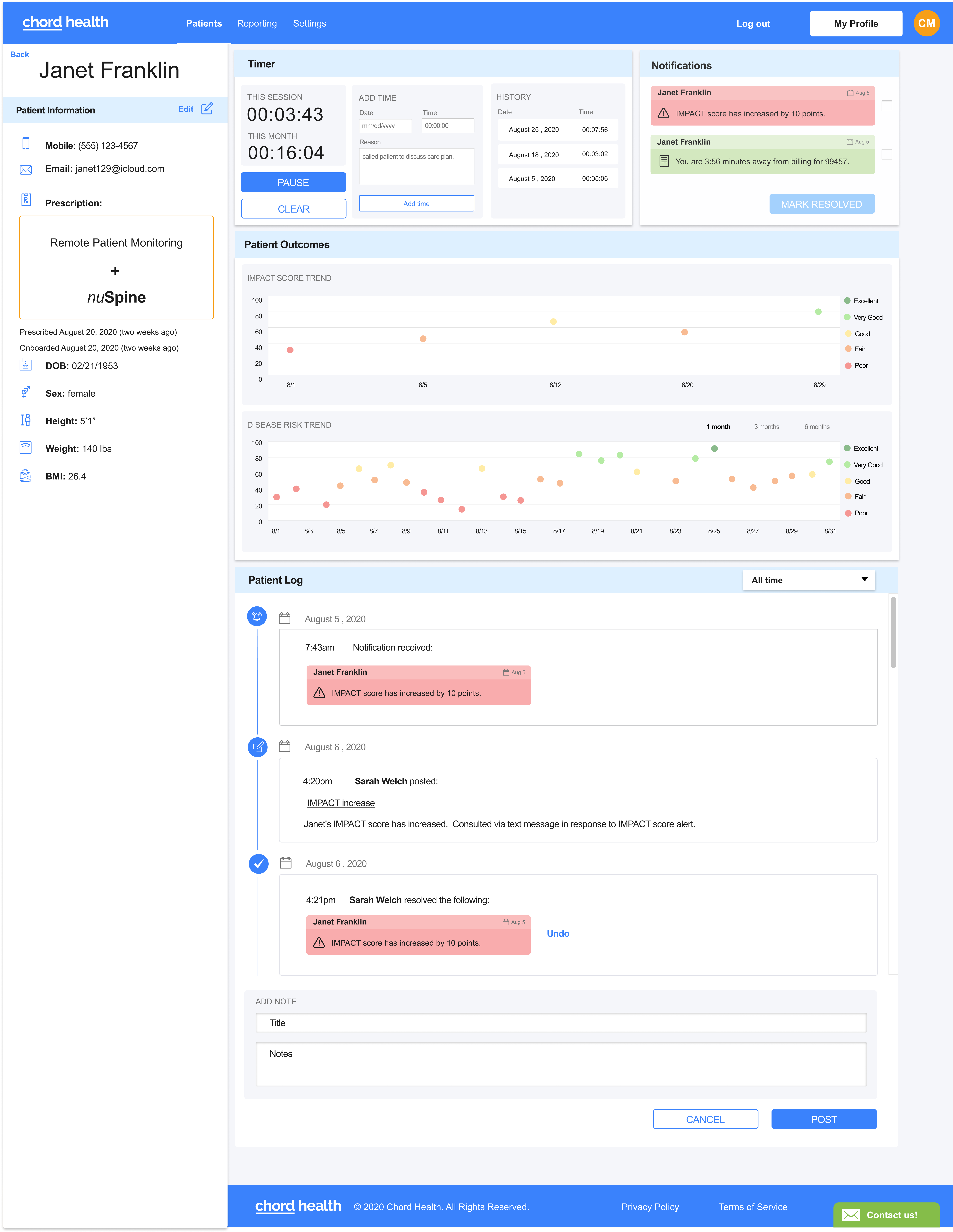
The patient profile I designed required an entirely new concept from the previous "Patient Detail Page", with features such as the timer, notifications, an additional graph, and the patient log.
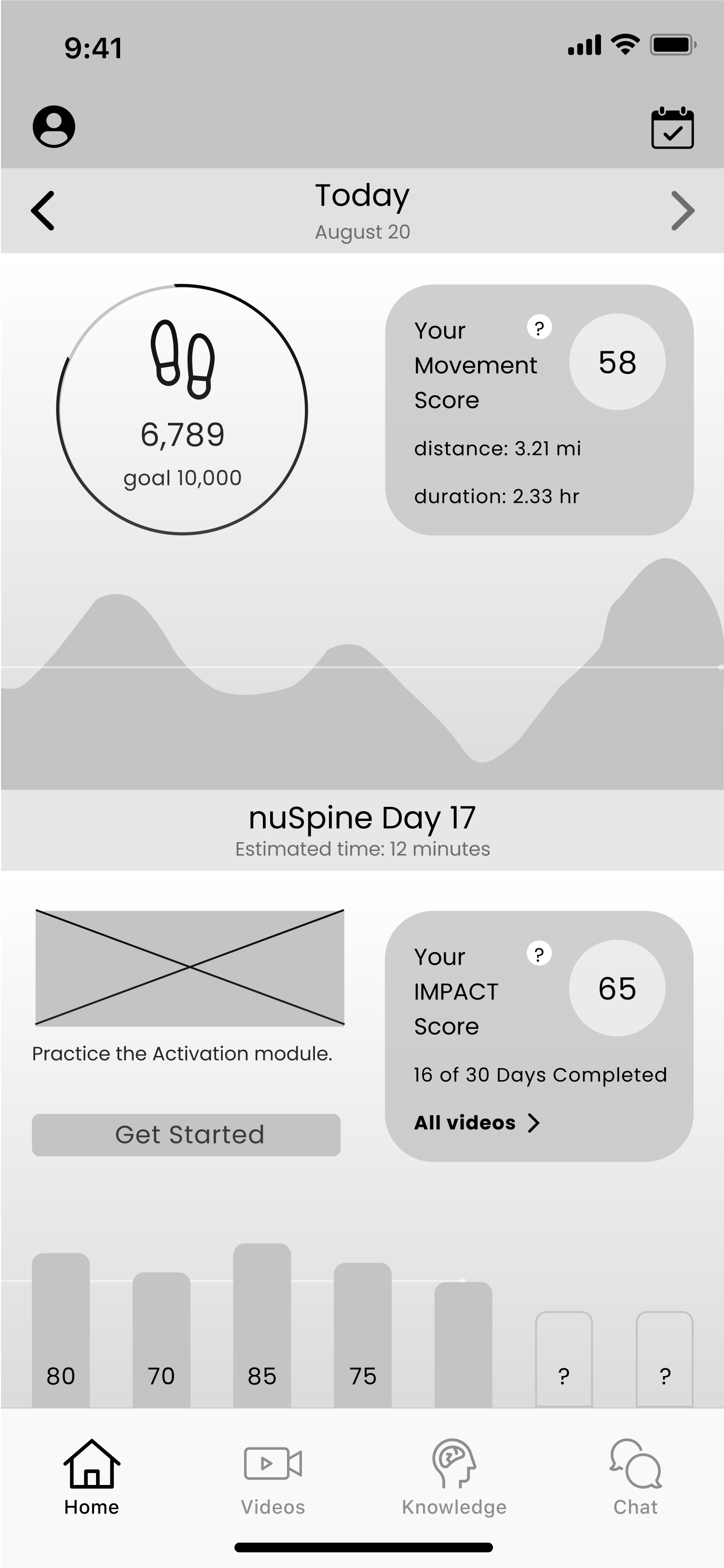
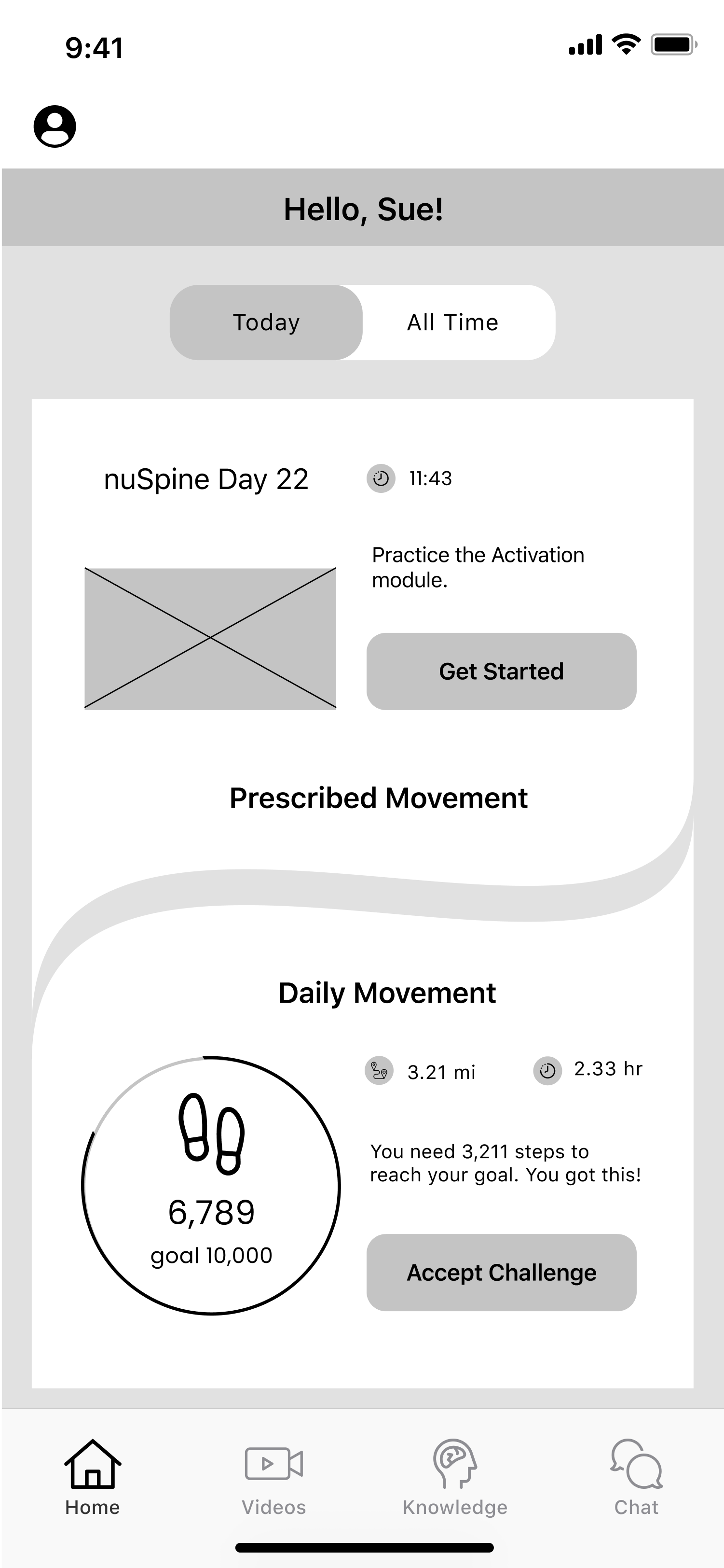
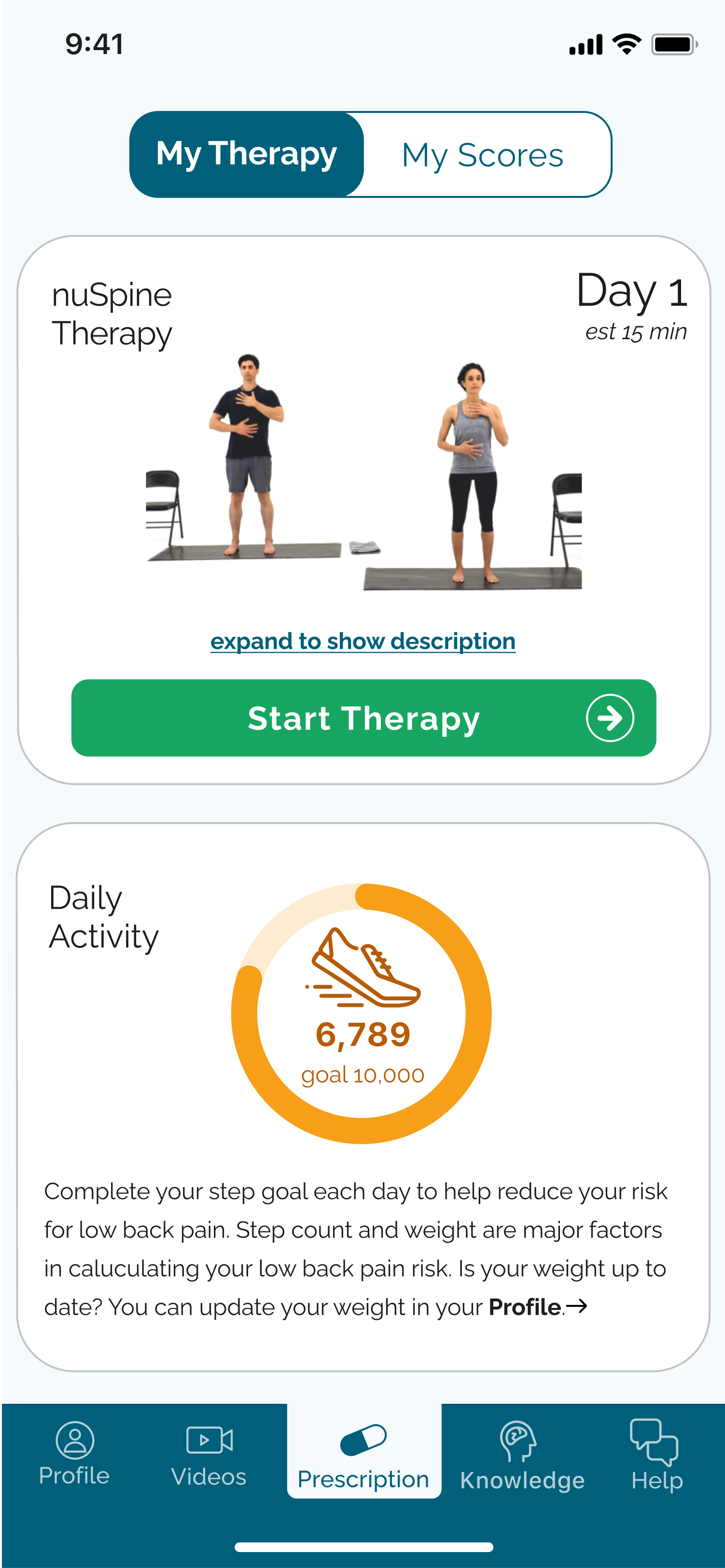
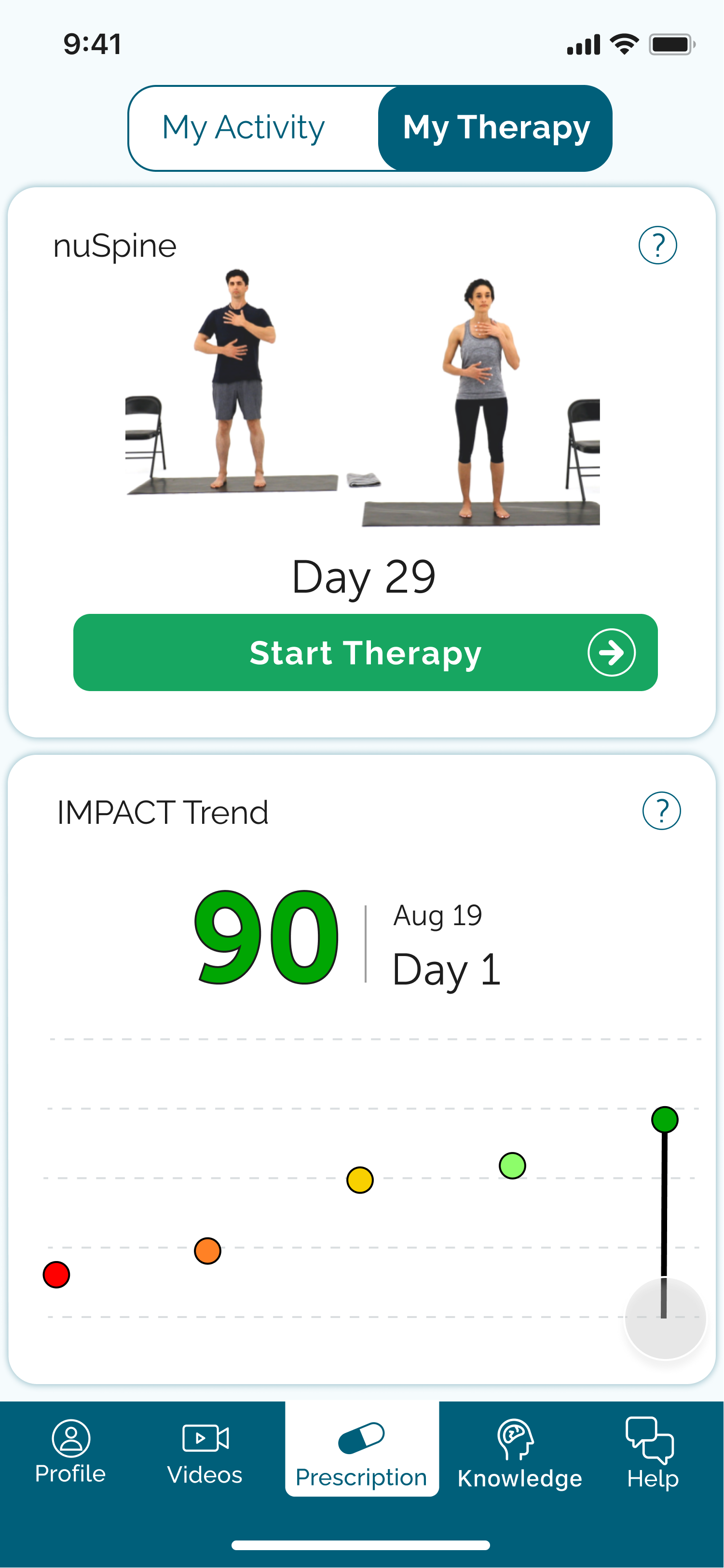
Since the mobile app was completely new, I went through a few iterations before settling on a design to mock up. My biggest challenge regarding the mobile wireframes was how to display the digital physical therapy and step tracking. We wanted patients to see both features as unique to each other but equally important, and I spent a lot of time playing around with how to marry these two concepts while showing them as two parts.
Visual design
Mockups
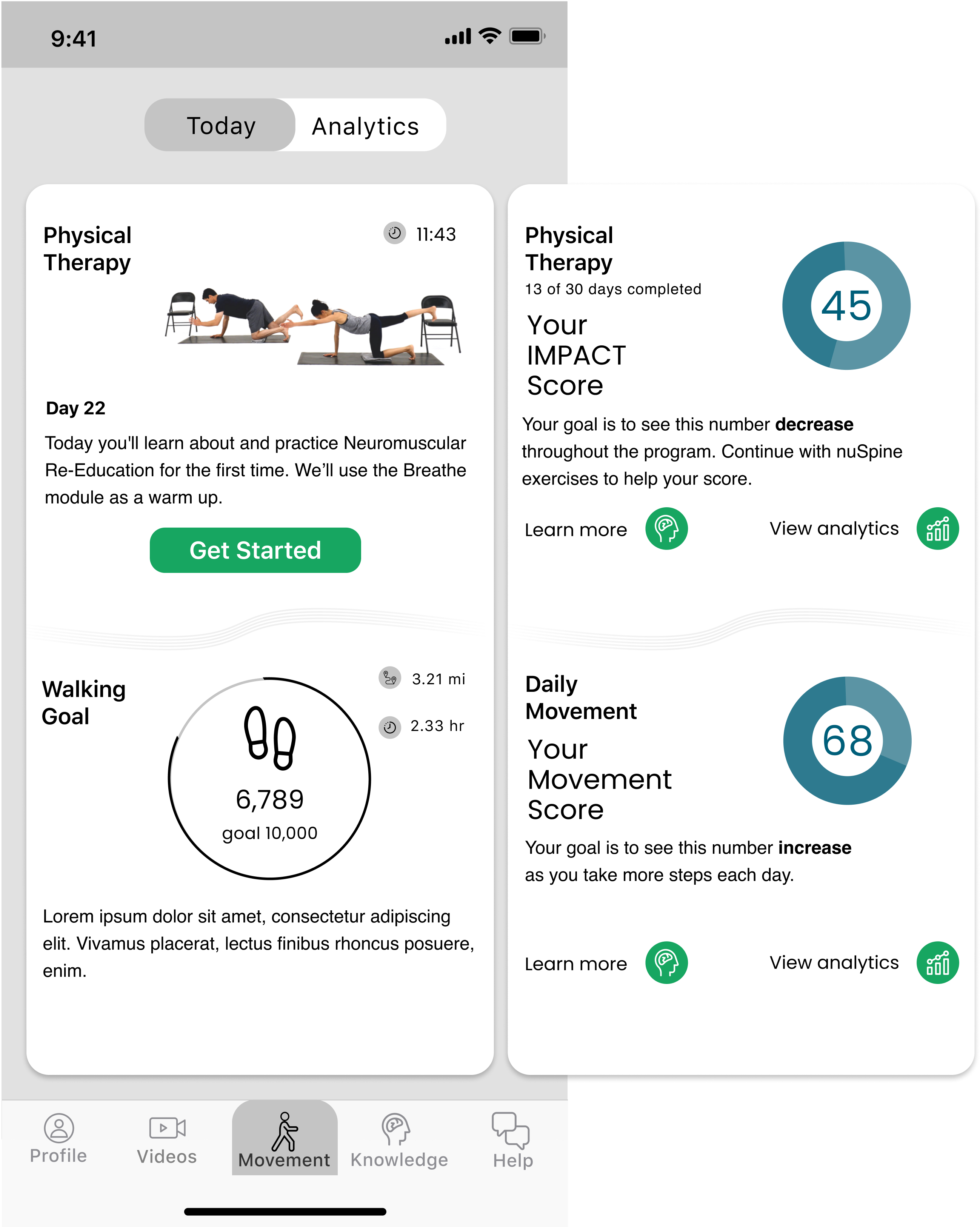
The transition from wireframes to high fidelity mockups was smooth for the provider web app, as I was building onto an existing product that had consistent styling throughout.
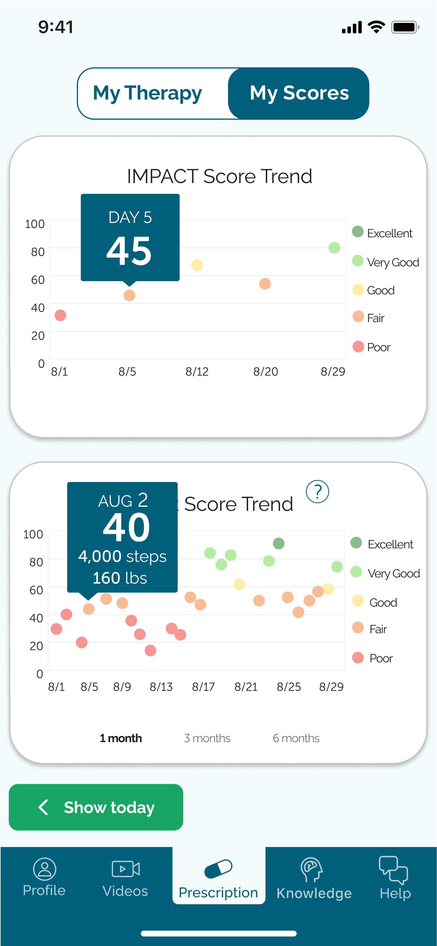
I did, however, get to flex my visual design skills when it came to high fidelity mockups for the patient mobile app. Chord Health had recently updated its branding but the typeface and color scheme had so far been used primarily in presentations. I got to take the new style guide as a starting point and create from there.
Prototypes
I created a clickable prototype from my mockup frames which allowed me to get a better picture of the user experience. I added some mobile screens to mimic the full experience, i.e. showing the prescription text message come up on the phone’s lock screen and how the user would go about downloading the app. This allowed the user to complete the full onboarding process and gave a more accurate depiction of a patient’s first interactions with the product.
We did some informal usability testing, asking family and friends to try moving through onboarding and seeing what they found. I made a few tweaks to the design based on the feedback, but overall we were happy to see that the onboarding process was solid. From here, I was able to deliver the refined mockups to our development team.
App update
After the initial app release, the needed improvements were painfully obvious. I realized quickly that scope creep had obscured my understanding of the app's true value, and I was eager to make design changes to remedy the flaws.
The main issue was that I had placed the Risk Score Trend chart within the secondary "My Activity" tab, which the user had to navigate to and then tap another button to get to. Originally, I had been thinking of the app as combination of digital physical therapy and risk scores. While this was true, the design was positioned to highlight the physical therapy videos, whereas the risk scores were almost hidden.
Explaining the risk score component to patients and trying to portray their value was difficult for a couple of reasons. For one, as I mentioned, the layout essentially hid this feature. Another issue worth noting was that the data points were designed to be tappable, so that the user could see their step count and score for any day they selected. However, the dots were so small that it was extremely difficult for users to accurately tap the data points. This was especially frustrating as our first round of patients were seniors, many of whom had some level of visual impairment. In our first big app update, I did a redesign of the dashboard to put more emphasis on the risk scores and added a slider to make it easier for users to view individual data points on the graph. This update proved to be a huge improvement in terms of usability for our patients.
Conclusion
The Chord Health app helps patients take control of their chronic pain through disease risk awareness. With easy access to granular data on how their lifestyle choices impact their likelihood for continued pain, patients are able to adjust their daily activity to decrease their pain over time. The design process helped me get to our current app version, but we are by no means done here. With every patient interaction we glean a little more insight on how to improve in the future, and we celebrate every time we get to let go of lesser ideas to make room for better ones.
Roles
Information architecture
Visual design
Usability testing
Mockup iteration
Deliverables
User stories
User flows
Wireframes
High fidelity mockups
Clickable prototype
Tools
Figma
draw.io
Lucidchart
Google Sheets
Zeplin
Confluence
Jira
See more projects
Furward takes the stress off of pet patients and their pets with a platform where neighbors can exchange pet care for free.
See case studyCamelot offers a cloud storage solution for users who need to store and send large amounts of data in a secure and simple interface.
See case studyBusyBus
BusyBus is a mobile public transit app that informs riders of ETA's for multiple busses using the same stop.
See case study