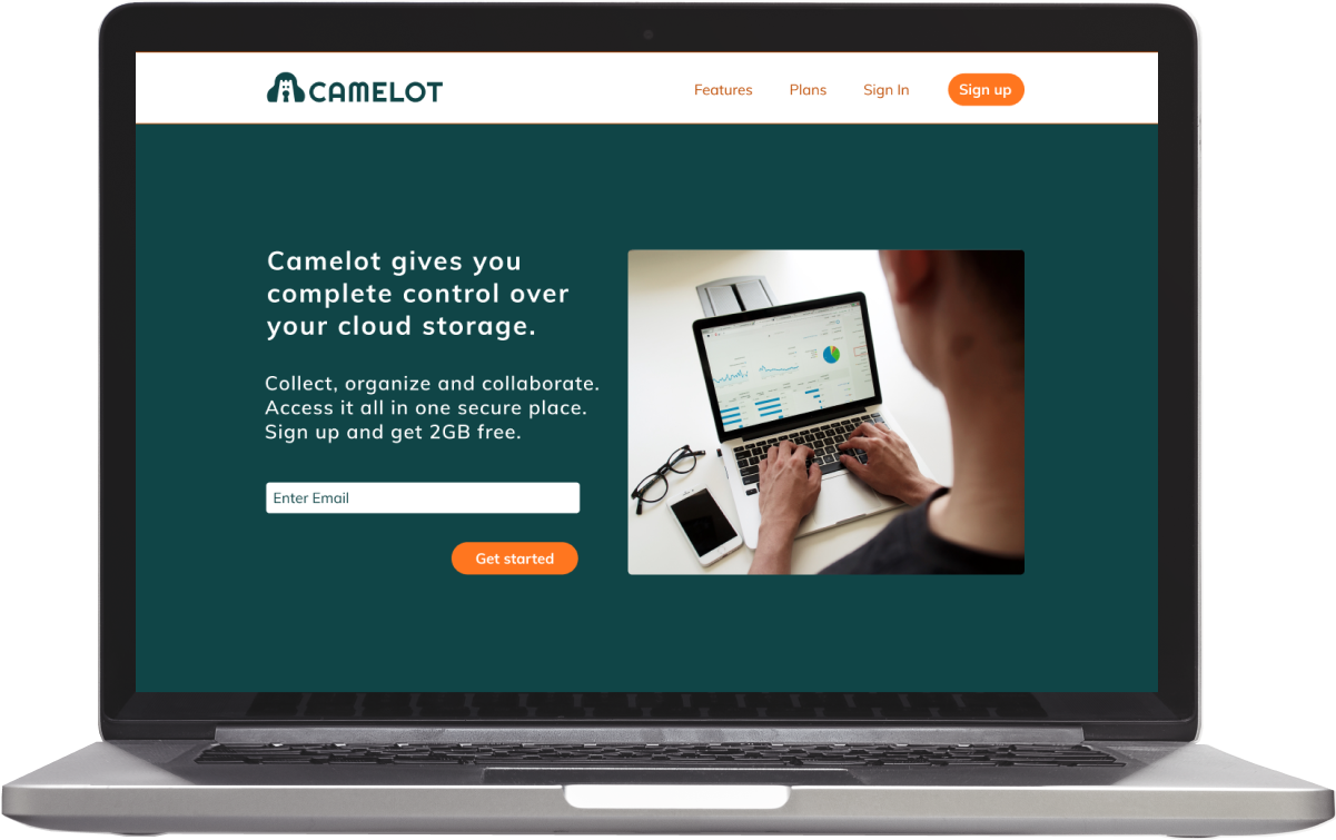
Camelot offers a cloud storage solution for users who need to store and send large amounts of data in a secure and simple interface.
Problem
Among current cloud storage options, users were still concerned about security and privacy, as well as the financial and capacity limitations of these services.
Solution
Discovery of barriers led me to design an app and brand that focused on privacy and security, unlimited storage and competitive price plans.
Discovery
User research
To kick off the discovery phase, I created a survey to get feedback on current cloud users and nonusers. I found that two-thirds of nonusers had privacy and security concerns keeping them from using cloud storage, and stronger privacy was a proposed improvement from current users. Among other suggestions were more free storage and larger file sharing capability. This feedback inspired brand values of privacy, security, and ample storage.
Strategy
Competitive analysis
My exploration of current cloud storage apps confirmed the issues I discovered in the user survey. Google Drive, Dropbox and Evernote all had privacy issues and a lack of zero-knowledge encryption in common. Addressing these weaknesses of privacy and security, issues users faced with current cloud storage and barriers that kept nonusers away, became my design focus.
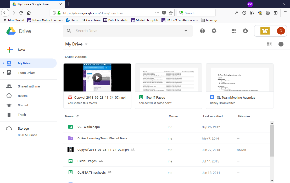
Google Drive
Strengths
- 15GB free storage
- Google Suite integration
- 3rd party app integration
- Easy to share files and folders
Weaknesses
- Need internet to use
- No block-level sync
- No zero-knowledge encryption
- Insufficient privacy
Opportunities
- Strengthen security
- Increase privacy
- Adopt block-level sync
Threats
- More secure cloud storage apps
- Apps with more privacy
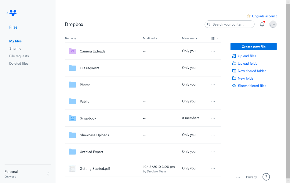
Dropbox
Strengths
- Office online integration
- Dropbox Paper
- Block-level sync
Weaknesses
- Expensive beyond free plan
- No zero-knowledge encryption
- Insufficient privacy
Opportunities
- Offer less expensive options
- Increase security
Threats
- Less expensive storage available
- More secure storage apps
User personas
Insight from the user surveys and competitive analysis informed my user personas. The first is a hobby filmmaker who needs to store video files, requires large amounts of data storage, and would benefit from a way to share files with his fellow filmmaker friends. The second is a professional in the renewables industry who needs a place to store large amounts of proprietary company data, namely previous projects, and a way to share the data with team members.

Thomas
Hobby filmmaker
Frustrations
limited hard drive space
buying external drives
file sharing difficulties
Needs
store large video files
unlimited data storage
share with fellow filmmakers

Danny
Asset Manager
Frustrations
no company database
no communication among teams
no secure project storage
Needs
store company data
share with team members
privacy and security
Information architecture
User flows
I mapped out the high-priority user stories to eventually test with users. I included processes for signing up, signing in, uploading files, organizing items, saving content, sharing and receiving shared items. Thinking about the actions for each step helped me to view each task from different user perspectives.
For example, one user might choose to sign up through Google and another user might prefer signing up through the app itself. Even a simple signup process can become complex when mapping out user flows, and it was a reminder of the importance of considering all possible decision points for potential users.
Wireframes
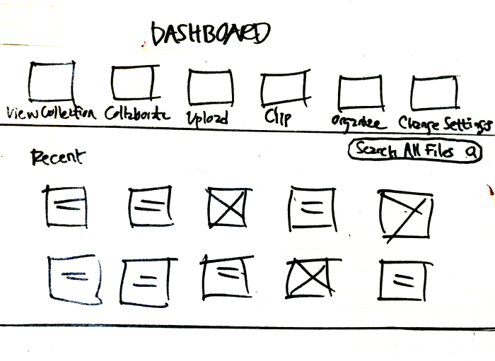
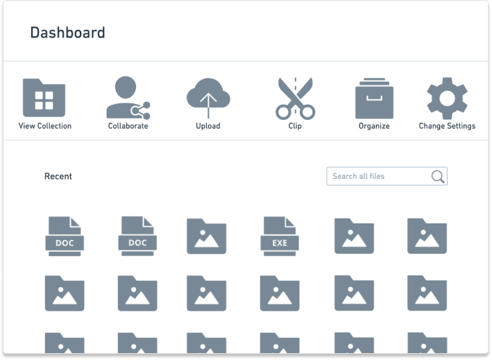
My first wireframes were very basic. I wanted to show the structure alone without the content, so there were no images, only buttons, icons and minimal text. I soon realized the importance of giving the wireframes some context so that they would make sense in the clickable prototype, so I refined them to include more detail, mainly in text form.
Mockups
My second set of wireframes were used to put together a clickable prototype, which I used in the first round of usability testing.The first user feedback I got was mostly about content clarity. For example, one of my participants pointed out that I had shown the pricing plans in an order that did not make sense to her. Another participant had expected to see a call-to-action in the pricing section.
My last participant struggled with finding the button to upload content, which was confusing because it was not consistent with other buttons in the prototype. I made a note of improvements to make for the next iteration, and I got confirmation that other than these few hiccups the prototype was easy to use and made for a simple user experience.
Visual design
Logo
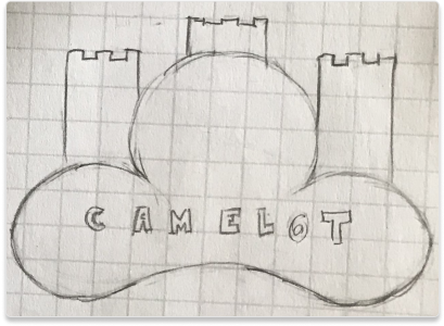
Through brainstorming brand ideas I came up with the idea to call the app Camelot. The initial train of thought was of a camel, known for being able to store large amounts of water (actually fat) in their humps, as a metaphor for the app’s ability to store large amounts of data in the cloud. I thought this could work because Camelot is known as the great castle associated with King Arthur. With the main brand differentiators being the unlimited storage and security features, I wanted these concepts to be present in the logo.
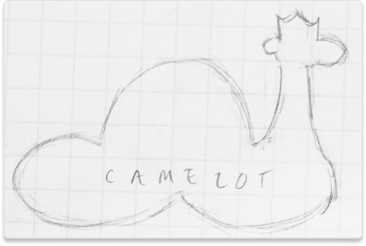
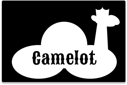
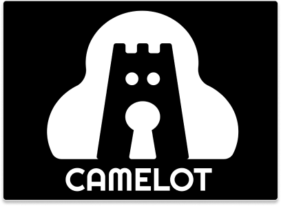
I later nixed the camel concept, worried that camels also conjure images of the desert and scarcity. I did not want such thoughts associated with the brand, however, I held onto Camelot. Inspired by King Arthur’s chief fortress, the legendary castle where he and his knights would collaborate at the Round Table, the Camelot brand draws parallels in that users collect, organize and collaborate in a private and secure place. The logo includes a cloud surrounding a castle containing a keyhole, echoing values of privacy and security, and in the negative space reveals a watchdog to evoke an additional sense of protection.
Typography
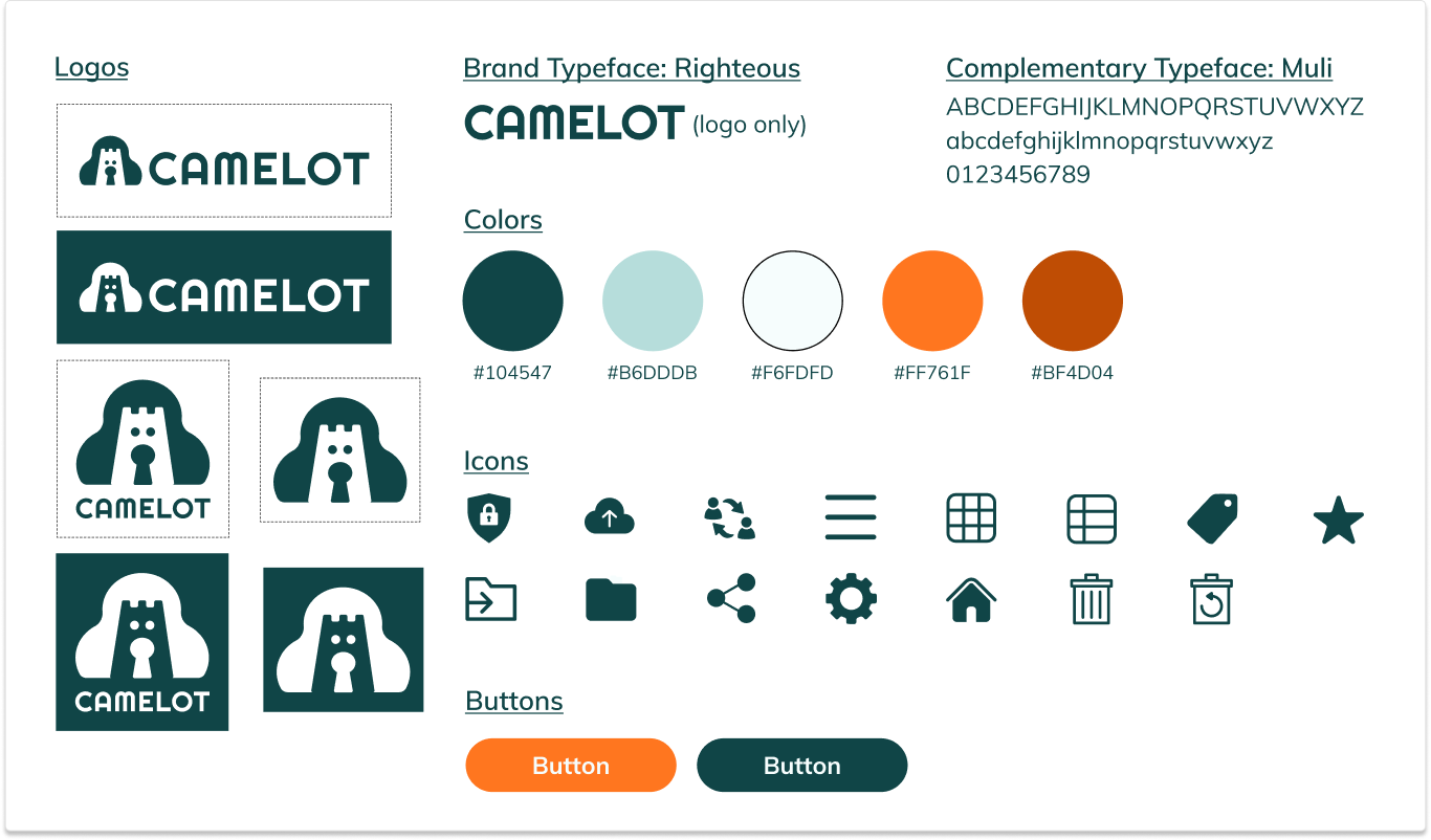
I chose Righteous as the brand typeface because to me it has a bold, sturdy appearance. I wanted to find a typeface that would come across as strong or dignified to align with associations of the original Camelot, and the brand values of privacy and security. I chose Muli as the complementary typeface because it is very readable and has a geometric quality that harmonizes well with Righteous.
Style guide
The style guide I created would serve as a set of standards for various assets within the brand. I included all logo configurations and directions for proper and improper logo use. I created a color palette. I chose dark teal for the logo and text color because it has the stable, trustworthy qualities of blue, and optimistic, harmonic properties of green. The contrasting oranges in my palette are energizing and I thought would serve well for calls to action and links. For the background color I chose the almost white light blue, a tint of the dark teal, which contrasts well with the other hues.
The guide also includes brand and complementary typefaces, icons and buttons, and typography styling for desktop and mobile. This guide is meant to be a tool for others to easily replicate and create similar assets for Camelot, a key for easy and proper brand representation.

Prototypes
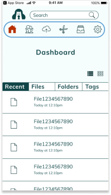
My first iteration was solid but it revealed that I had made some functions of the app redundant. For example, I had separate screens for different actions when each screen was roughly the same layout but with a different title. For my second iteration I combined these actions directly on the dashboard, which made navigation much smoother.
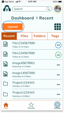
Using my high fidelity mockups, I created a clickable prototype and performed another round of user tests. Usability testing revealed that I had some vital changes to make to my prototypes. For one, users pointed out that I had completely missed including a way for users to sign out of the mobile app. Another change motivated by user test results was to eliminate the three dots “more” icon and include icons for the move and share actions.
As I was observing I also realized that I didn’t make it clear how one would share multiple items. I had initially thought users could select a few by clicking on multiple items and then hit the “more” icon, but this action lacked signifiers so users didn’t know this was possible. I determined a solution to use checkboxes in combination with the “move” and “share” icons, which would resolve the issues my participants had with these actions in one swoop.
Performing usability tests on my prototypes showed me several areas where usability could be improved, and the reactions of my participants would inform important changes to my design.
Mobile
1. Combined actions on separate screens into one dashboard.
1st iteration
2. Added an account menu and subsequently a hamburger menu including a way to sign out of the mobile app.
2nd iteration
3. Added “more” icon and later replaced with checkboxes.
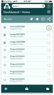
3rd iteration
1. Combined actions on separate screens into one dashboard.
2. Added an account menu and subsequently a hamburger menu including a way to sign out of the mobile app.
3. Added “more” icon and later replaced with checkboxes.
Desktop
1. Combined actions on separate screens into one dashboard.
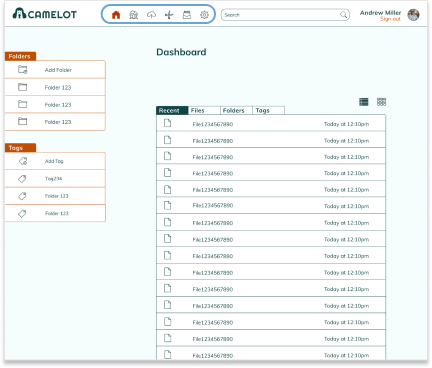
1st iteration
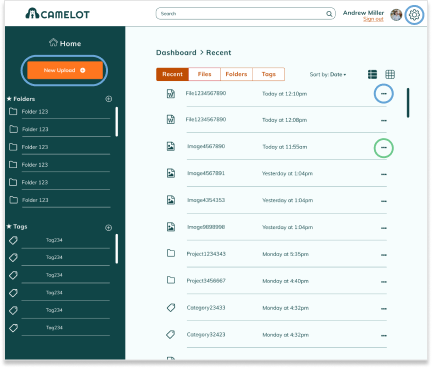
2nd iteration
3. Added “more” icon and later replaced with checkboxes.
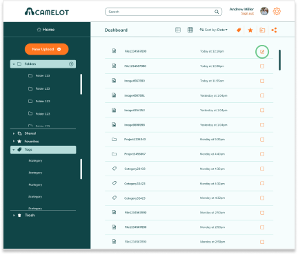
3rd iteration
Preference testing
For more user feedback, I tested three elements in my design where I considered more than one potential style. The first was simply whether a button should be square with rounded corners or completely rounded. Initially, 67% of participants said they preferred the rounded option, however I only had 12 responses so the difference was not statistically significant. I repeated this test later on and increased the white space around each button to make sure that I wasn’t creating a bias due to perceived crowding of the element, and with 21 responses I got the exact same result: 67% preferred the rounded button. I had initially decided on the square buttons, but I changed the shape of my buttons to reflect this preference.
The second test was which popup screen I should use, and 69% of participants chose the centered popup over the side popup. This was the style I chose initially, so I simply kept this screen the same. The last test was on the color scheme, and whether the side bar should be dark and the rest of the screen light or vise versa. With 83% of participants confirming my preference for the light majority, I kept this screen as is as well.
Which button design do you prefer?
33%
67%
Conclusion
Through the design process I created a simple interface for users to navigate their cloud storage needs. In reflecting on this project, my biggest takeaway was how complex the design process is, from start to finish, and how valuable each step is in creating a worthwhile product. While parts can be tedious, more research, testing and thoughtful branding leads to a stronger design. User testing can quickly point out issues that you were initially blind to, and iteration, though taxing, always produces results.
If I had more time, I would do a second survey. Once I progressed further in the project, I thought of more questions to ask and got clarity on how I could have asked some of my questions differently. Having more input early on could have given me more confidence in my early designs. I would also spend more time on the visual design of the site, perhaps adding more texture or images to enhance aesthetics. In future projects, I will continue to rely heavily on user feedback early and often in the design process and reflect thoroughly on how each step can provide key insights to move forward.
Roles
User research
Information architecture
Branding
Visual design
Usability testing
Mockup iteration
Deliverables
User surveys
Competitive analysis
User personas
User stories
User flows
Wireframes
Branding
High fidelity mockups
Clickable prototype
Tools
Figma
UsabilityHub
InVision
Whimsical
draw.io
Google Sheets
Google Forms
See more projects
Chord Health helps patients with musculoskeletal conditions understand and manage risk factors for chronic pain through a mobile app.
See case studyFurward takes the stress off of pet owners and their pets with a platform where neighbors can exchange pet care for free.
See case studyBusyBus
BusyBus is a mobile public transit app that informs riders of ETA's for multiple busses using the same stop.
See case study