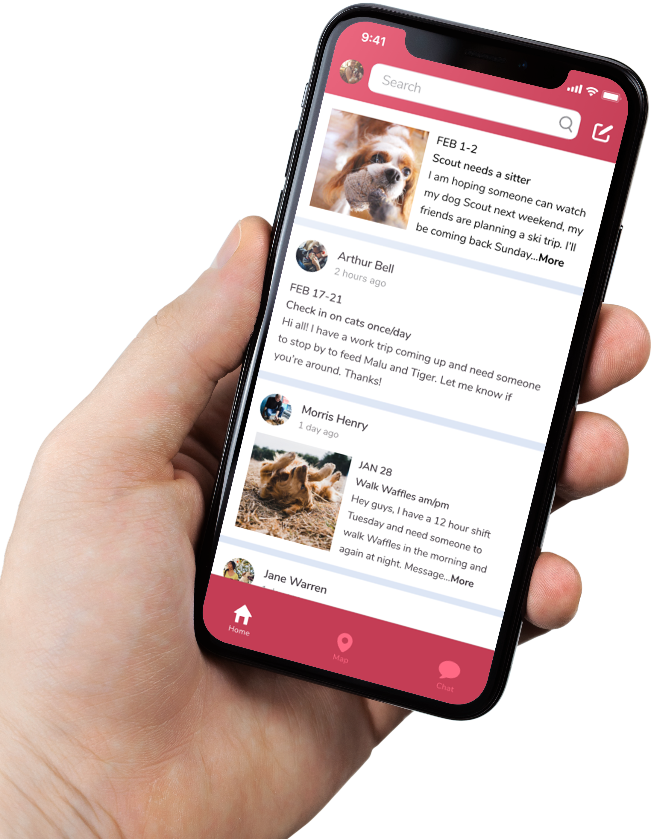
Furward takes the stress off of pet owners and their pets with a platform where neighbors can exchange pet care for free.
Problem
Pet care is challenging for many pet owners. Some issues include professional pet care expenses, guilt about leaving pets away from home or with strangers, and feelings of imposition on friends and family. Pet owners want to take good care of their pets, but they don’t always have options that allow them to travel without worry.
Solution
Furward is a platform where users can connect to nearby pet owners and swap pet care for free. It eliminates costly pet care and allows pets to stay with neighbors near home where they’re comfortable. The reciprocal nature of the app allows users to return the favor when someone watches their pet, reducing feelings of imposition on others in their network.
Discovery
User research
My main assumption that I wanted to test going into this research was that paid pet care is expensive, and people would rather rely on family or friends to look after their pets than pay for pet care. I found this assumption to be true, but there are a number of other factors I discovered that people care about when it comes to pet care. For one, it is important to people that their pets receive quality care. People also don’t like leaving their pets with strangers, and would rather have them stay at home where they’re comfortable. Another valuable thing I learned was that people overall said they would be open to trading pet care for free.
Something I learned in receiving feedback about my survey was that some of the questions I asked were leading. For example, I asked, “What is the main reason you used a pet care service?” and the first answer option was, “I didn’t have friends or family in town that could look after my pets.” I made an assumption that people would go to friends or family before considering professional pet care, which made the question seem biased against paid pet care. I realize that some of my survey results may have been skewed by this bias, and if I were to conduct this research again, I would revise the questions to have a more neutral tone.
Another thing I realized after completing my analysis was that 73.3% of my participants were between the ages of 19 and 34. I had been generalizing by saying “people” to describe my participants, when the vast majority of them were millennials. This was another bias I looked past and while I did not intend for this app to be for millenials only, I have to consider that my survey results are mainly representative of this population.
Strategy
Competitive analysis
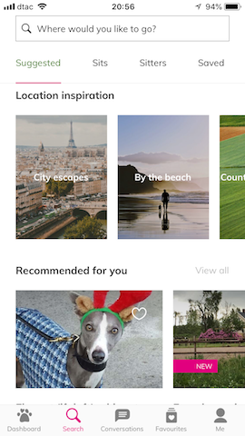
When I began to research other pet care companies, almost all were paid pet sitting services. The three I found most similar to my idea were TrustedHousesitters, Dogma.me, and Petfam. TrustedHousesitters matches pet sitters with homeowners with pets, and sitters exchange pet care for a place to stay. This company is targeted mainly at travelers and has an annual fee. While free pet care is involved, the services exchanged are different on each end, so my app would have a different mission altogether. Additionally, I want my app to be completely free which is a differentiator in today’s pet care market.
Dogma and Petfam both provide free pet care and have a similar mission to mine. Petfam also has an annual fee, so while the pet care itself is free, users pay $75 upfront. The drawbacks of both Dogma and Petfam are their limited user population, with Dogma limited to a few US cities and Petfam mostly in Canada. My app could benefit users in locations unreached by these services. Additionally, neither has a mobile app, so I found an opportunity to create an app for exchanging free pet care that does not yet exist.
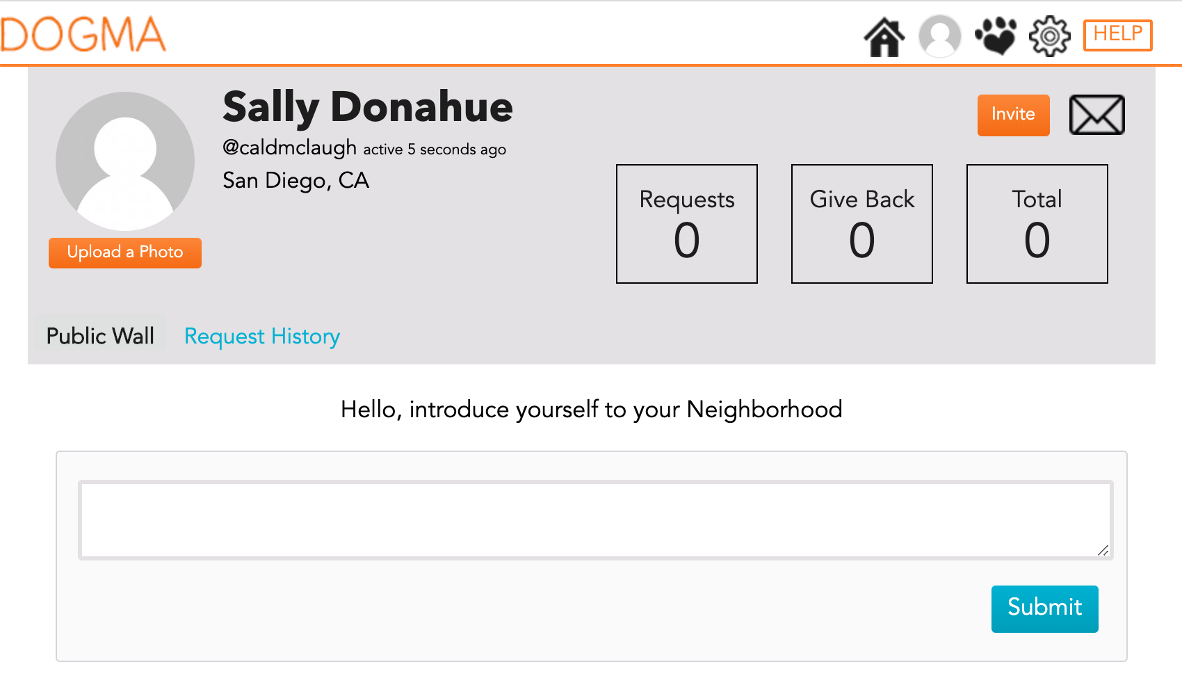
Dogma
Strengths
- Clean, well-organized, easily navigable website
- Content feels trustworthy, connects to users emotionally
- Saves users money while connecting neighbors
Weaknesses
- Only 5 locations in U.S.
- No mobile app
- Limited midday care
Opportunities
- Expand locations to broaden user base
- Create a mobile app
- Target people who work from home to increase midday care
Threats
- Competitors with more reach
- Since free, no guarantee of decent customer service
TrustedHousesitters
Strengths
- Simple, straightforward site
- Allows for pets to stay in their homes
- Saves travelers money
- Mobile app
Weaknesses
- Complaints of poor customer service and reachability
- Limited protection for sitters and homeowners
- Disproportionate sitter:owner ratio
Opportunities
- Improve customer service
- Increase vetting for new sitters to help even out the ratio
Threats
- Poor reviews may streak company reputation over time
- User loss due to customer service frustration
User personas
I created three personas for users of a free pet care exchange app. One user is a cat owner in a new city who wants to travel and make friends while saving money on pet care. Another is a dog owner who needs help walking his dog on long workdays. The third is another dog owner who wants to find care for her dog on short notice and avoid inconveniencing friends.
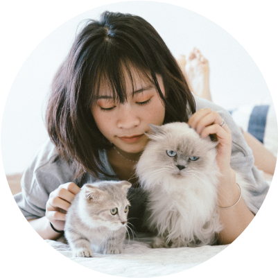
Mai
Journalist
Frustrations
costly pet care options
not knowing anyone in a new city
guilt when she leaves her cats alone
Goals
find someone to watch her cats when she travels
spend less on pet care without compromising quality
make friends in a new city
travel guilt-free
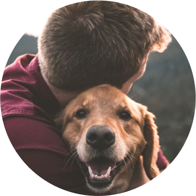
Nick
Landscaper
Frustrations
spending his lunch break taking his dog out
feeling drained and not giving his dog adequate attention
Goals
find someone to walk his dog on long workdays
keep his dog healthy and happy
save time and energy during the work week
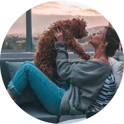
Sami
Server
Frustrations
expensive LA life
paying for last minute dog care
Goals
find last minute dog care
save money
avoid inconveniencing friends
Information architecture
User flows
I created user flows for five aspects of my project, including onboarding, creating and responding to posts, actions from dashboard feed and map, messaging and editing an account. These flows helped me to map out the different steps that I would need to make the app intuitive to navigate through, and came in handy when I went to do my wireframes.
Wireframes
I created digital wireframes with Figma with the content I intended to include in the final prototype. For my first iteration, I relied heavily on my user stories and user flows as I went through each screen to make sure everything flowed in a sensible way. I only made minor changes in my second iteration, one of which was changing the layout on the “New Post” screen to give users more room to add details or their request.
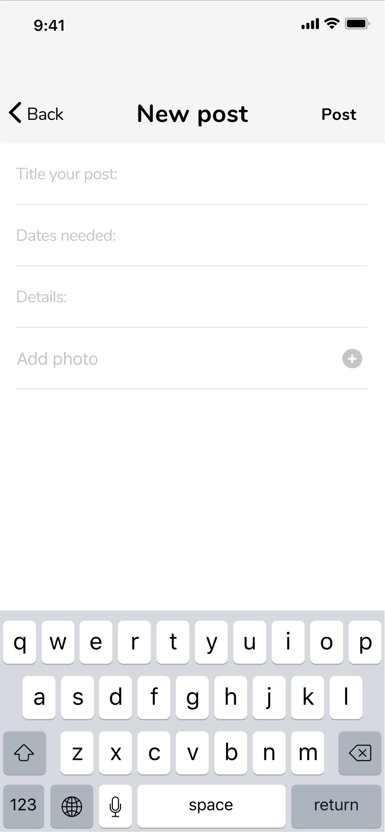
1st iteration New Post
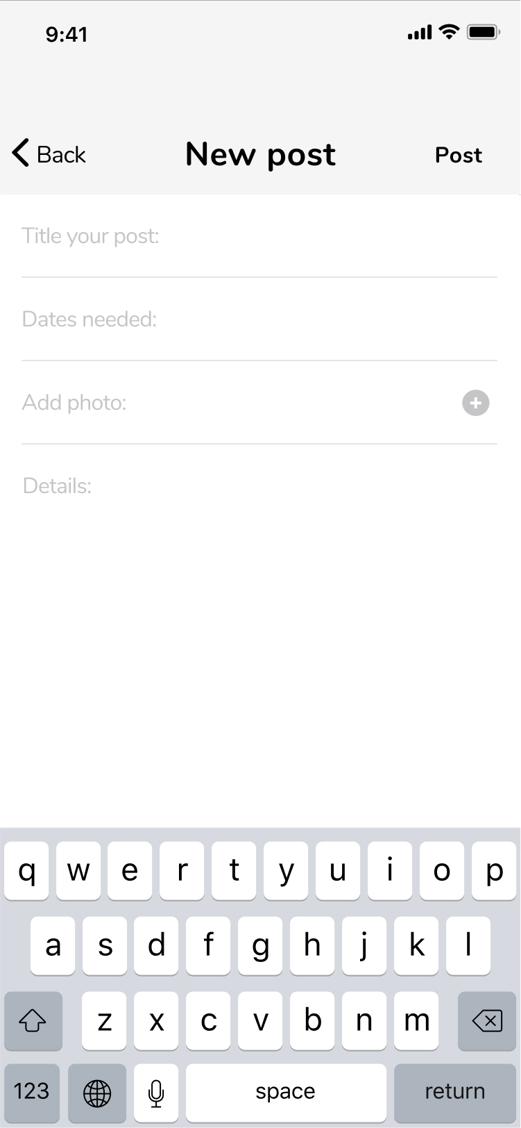
2nd iteration New Post
Another change I made was in response to feedback that the “Write a post” bar looked more like a search bar than a place to write a post. I decided to make that into a search bar and added a compose icon next to it to symbolize the “New Post” action.
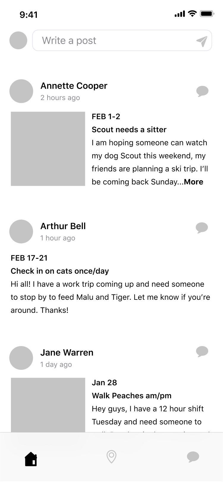
1st iteration Feed
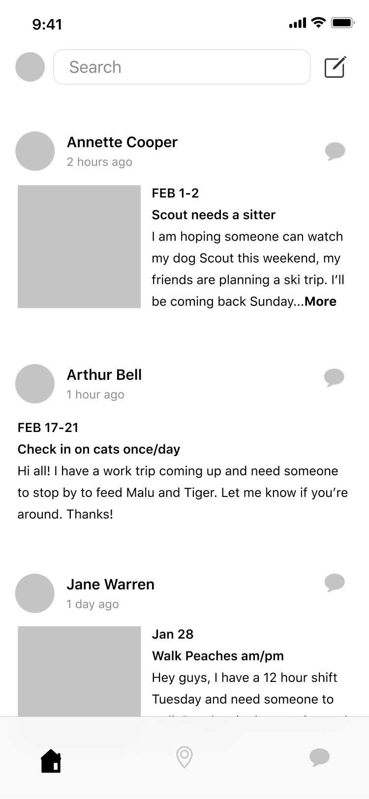
2nd iteration Feed
Visual design
Logo
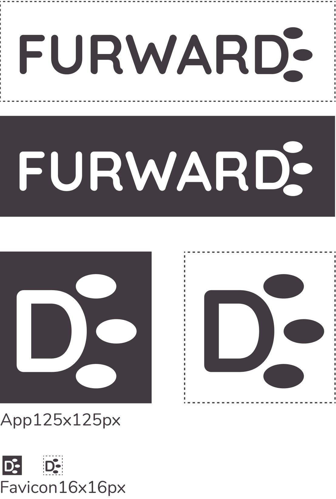
The idea for the brand name and logo is from the reciprocal nature of the app, where users pay it forward and help each other out with free pet sitting. I thought adding the pun would make it obvious that the app has to do with animals, and I wanted it to have a friendly cutesy feel to match the positive emotions surrounding pet ownership. The logo I created consists of the word “FURWARD” in with the “D” made into a sideways paw print. I thought about filling in the “D” to make it solid and more like a paw print, but I was worried that the logo might read “furwar” for some. The symbol part of the logo without text is simply the “D” and paw print alone.
Typography
I decided on Quicksand for the brand typeface and Nunito for the complementary typeface. Quicksand has a rounded, geometric shape to it which I felt looked both friendly and strong. I want the typeface to show that the app is approachable, but also have a boldness that shows users that it is trustworthy. Nunito has a similar rounded and geometric shape, and is legible at all sizes. Readability is especially important since it is for an app, where users will be viewing the typeface in small sizes.
Quicksand
- ABCDEFGHIJKLMNOPQRSTUVWXYZ
- abcdefghijklmnopqrstuvwxyz
- 0123456789
Nunito
- ABCDEFGHIJKLMNOPQRSTUVWXYZ
- abcdefghijklmnopqrstuvwxyz
- 0123456789
Color palette
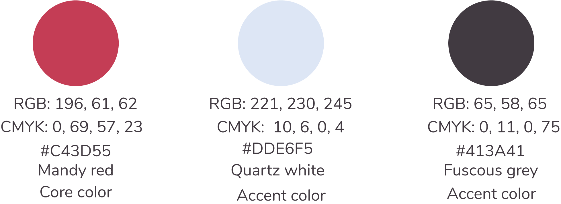
My color palette consists of chetwode blue, mandy red, quartz white, and fuscous grey. I chose chetwode blue because I want users to trust in the product, and this cool hue mixes the calmness and responsibility of blue and the romance of purple. I chose the mandy red because I want to represent the passion and love people have for their pets, and these qualities are associated with red. This hue is more of a pastel, which softens it and appears less harsh than a bright red which is also associated with fire and violence. The quartz white is a neutral color that contrasts well with the accent colors, and which mixes the cleanliness and simplicity of white with the calmness, responsibility and romance of the chetwode blue. I chose the fuscous grey to be a neutral, contrasting color that is sophisticated and softer on the eyes than stark black.
Prototypes
With mockups strengthened with initial feedback, I went on to create a prototype. I linked my mockups together in Figma and tested it out through usability testing. I found that all three of my participants were able to perform each task I asked of them with little hesitation. However, my first usability test provided virtually all of the edits I would make in the next iteration.
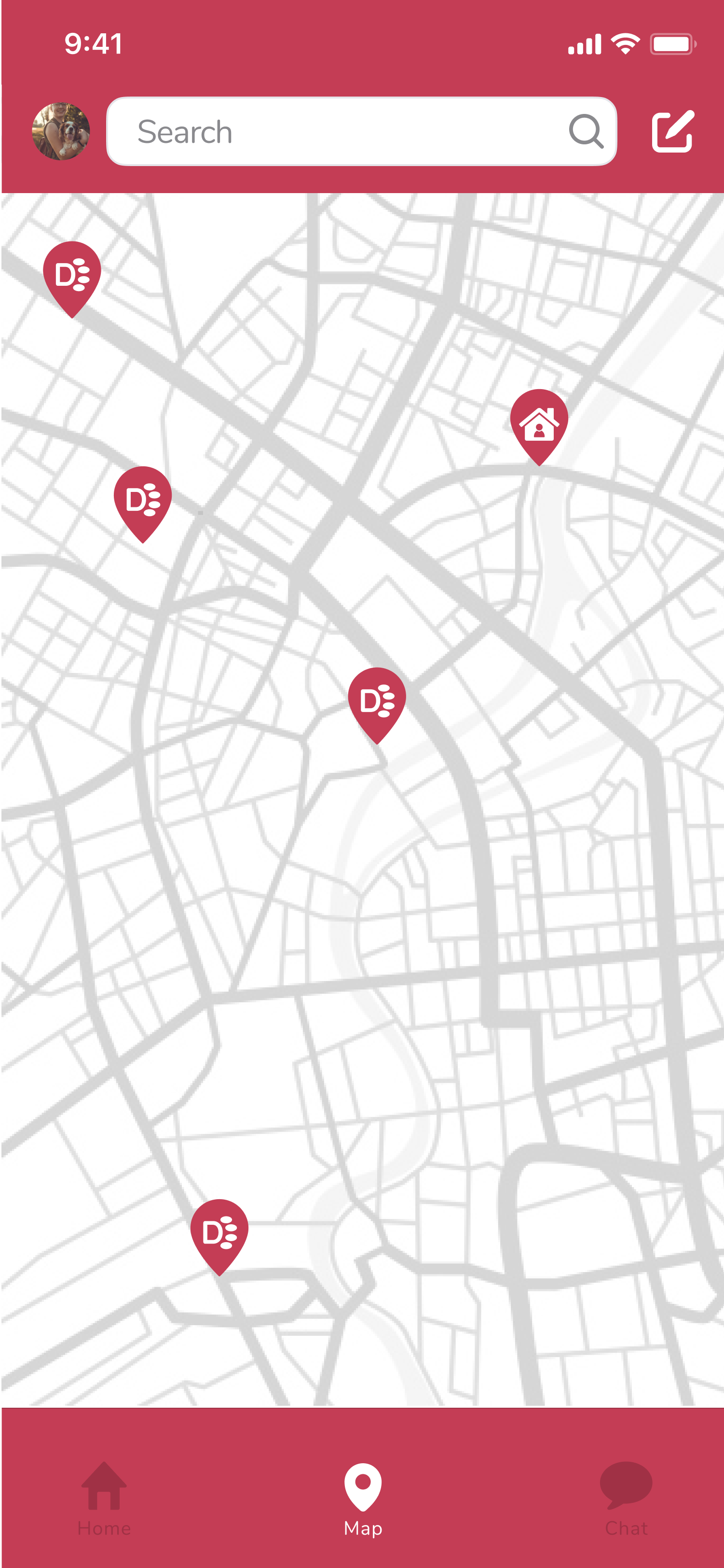
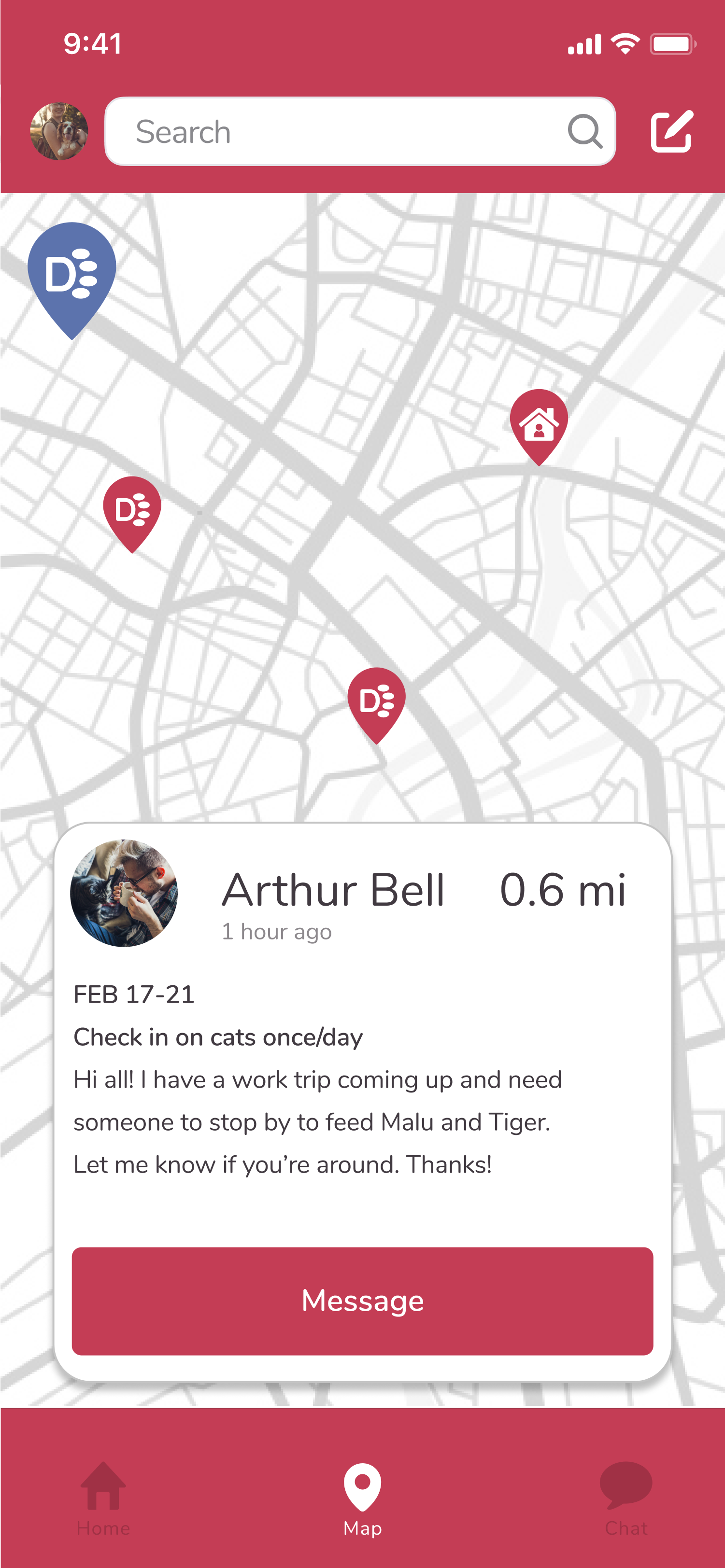
My first participant had a different idea about what the paw print location pins and home location pins meant than what I intended. In my next iteration, I added a screen to the prototype that responds when a user touches the home location pin, so that the user can see the difference between this one and the paw print location pin.
Map 1st it
Map other user 1st it
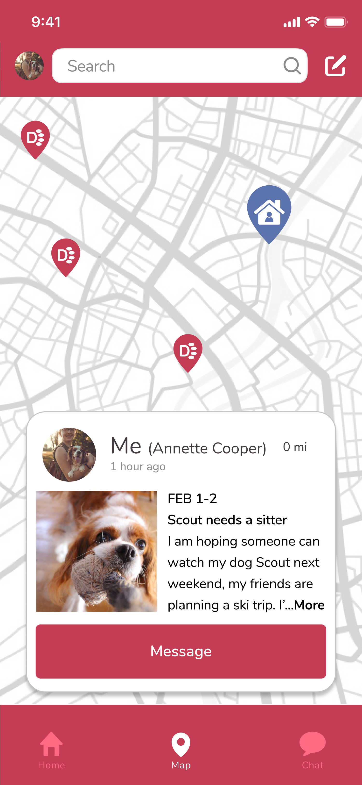
Map current user 2nd it
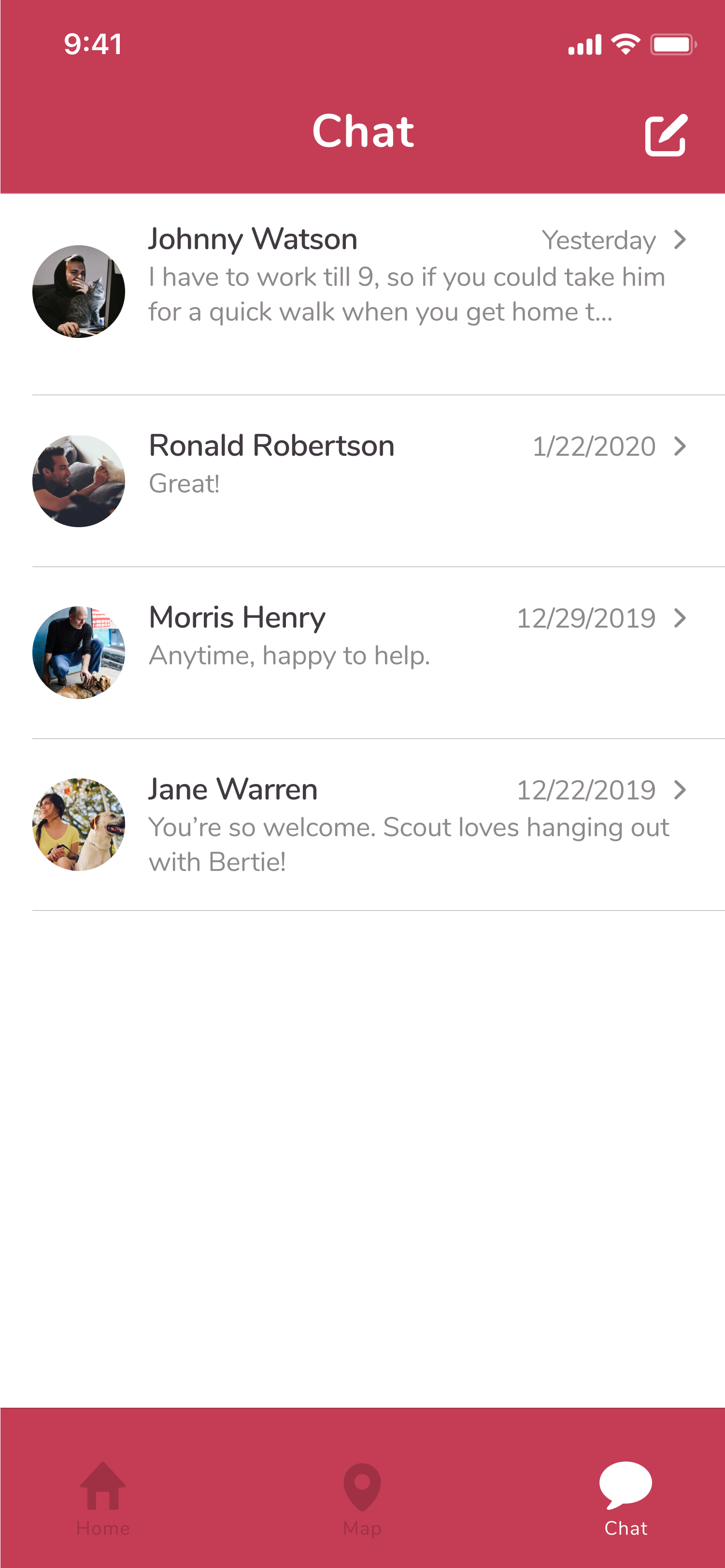
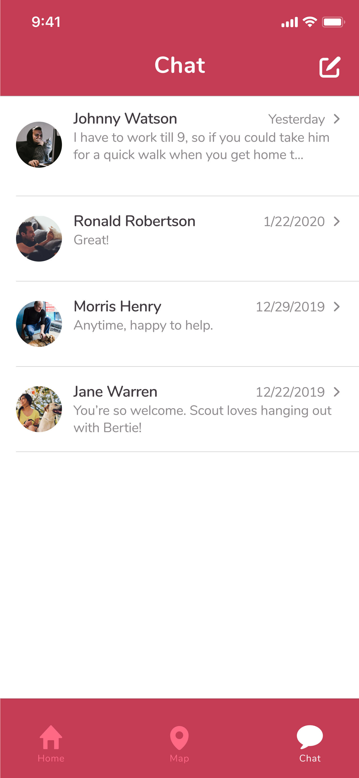
Secondly, this participant commented that the shades of red on the tab bar indicating the unselected icons made them look inactive, which prompted me to try out a different shade there. I swapped out the dark shade for a lighter version of the red and ran a preference test to see which performed better. The lighter shade was preferred by 63% of participants, so I changed the icons in the second iteration.
Conclusion
I solved the problems with current pet care practices by creating an app that allows users to connect to nearby pet owners and swap free pet care on a pay-it-forward basis. The design process informed the decisions I made from concept to clickable prototype, and I learned some things along the way. My initial assumptions were supported by my user research, but I learned that the results may have been skewed by the wording of some of my questions and my millenial-heavy sample. Given more time, I would rephrase some of the questions in my survey and deploy it a second time to see how the results change. I would also target participants over the age of 34 to balance out the age representation. I will remember the shortcomings of this project, namely in the user research step, and make a point to avoid these to strengthen future designs.
Roles
User research
Information architecture
Branding
Visual design
Usability testing
Mockup iteration
Deliverables
User surveys
Competitive analysis
User personas
User stories
User flows
Wireframes
Branding
High fidelity mockups
Clickable prototype
Tools
Figma
UsabilityHub
InVision
Whimsical
draw.io
Google Sheets
Google Forms
See more projects
Chord Health helps patients with musculoskeletal conditions understand and manage risk factors for chronic pain through a mobile app.
See case studyCamelot offers a cloud storage solution for users who need to store and send large amounts of data in a secure and simple interface.
See case studyBusyBus
BusyBus is a mobile public transit app that informs riders of ETA's for multiple busses using the same stop.
See case study