BusyBus
BusyBus is a mobile public transit app that informs riders of ETA's for multiple busses using the same stop.
Problem
Due to expansion, many routes now shared the same bus stop, so riders didn’t know whether it was their bus at the stop as they approached.
Solution
Design a solution that informs riders what the next arriving bus is, and how much time they have to get to the bus stop.
Discovery
User research
To understand feelings surrounding public transportation, I created a survey with questions about bus transit, using conditional logic to address particular questions based on use level. Survey analysis revealed that over half of the riders said the bus is late at least weekly, and 68% said live updates would be the most helpful feature to them. From this data I arrived at two main findings: that bus schedules are unreliable, and that live updates on a bus’s location would help solve the big problem.
Strategy
Competitive analysis
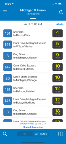
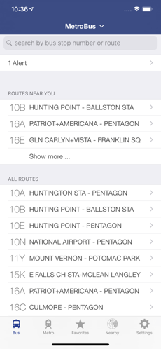
I reviewed two existing transit apps to see what was working or not working for them. I looked at Transit Stop, a Chicago-based transit app that is linked with Chicago Transit Authority’s tracking system, as well as DC Metro, a similar Washington, D.C. commuter app. Both apps feature live updates on bus locations as their primary selling point. The main weaknesses for both were unreliable arrival predictions, and each had strengths in additional features such as route delay alerts and stop saving abilities. While these apps were strong contenders, their single city audiences limit the apps’ scope. A new transit app with more reach could be successful for a wider user population.
Information architecture
Paper prototype
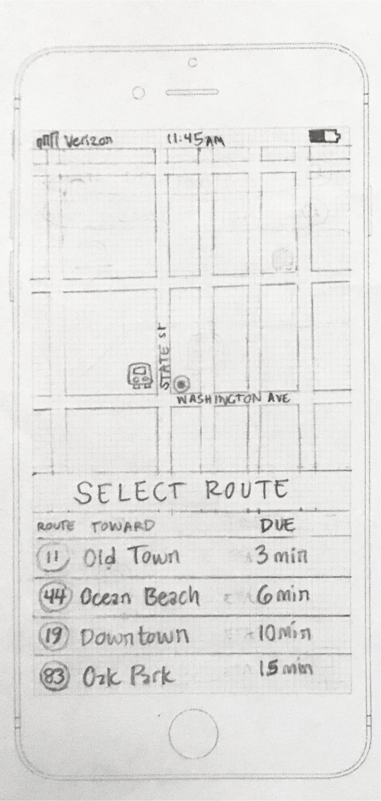
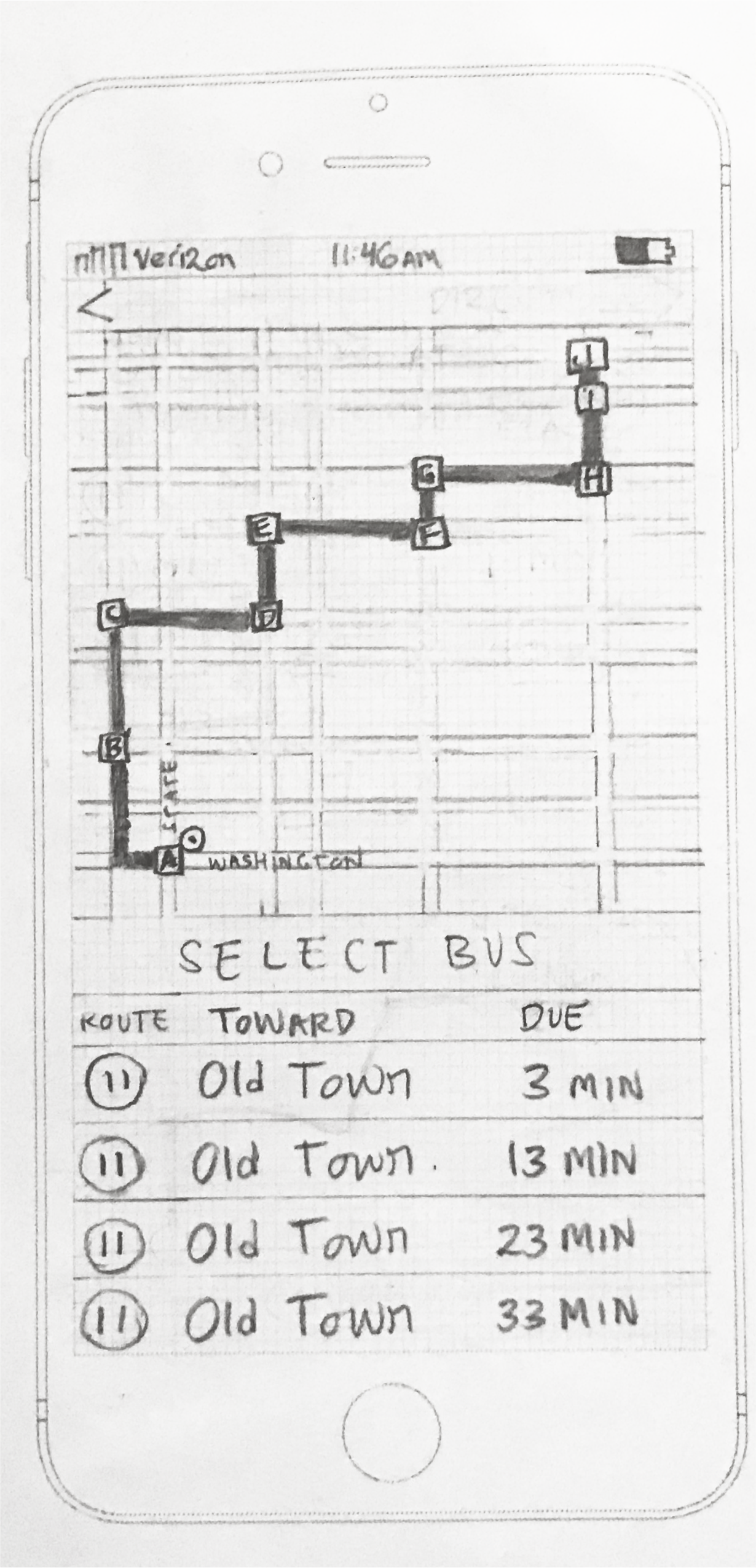
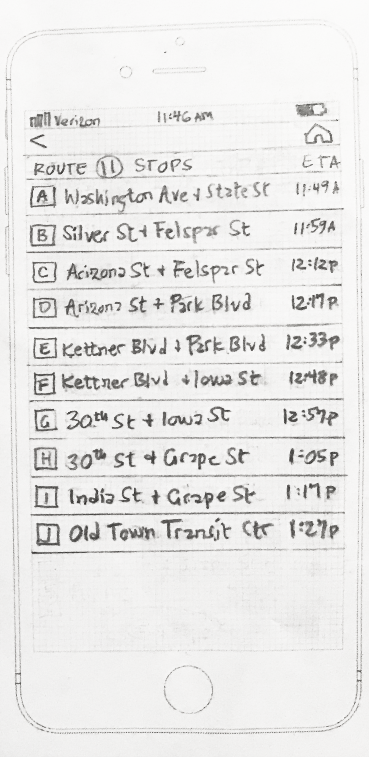
With my user stories in mind, I sketched up the screens a user would need to locate their bus. A user can see their current location and respective bus routes on the first screen and select a route, display all stops to their destination and a list of upcoming busses with arrival estimates on the second screen, and see all stops listed for the selected route on the third screen.
Usability testing
I tested out my paper prototype by asking participants to complete tasks such as identifying which is the next arriving bus and how much time is needed to get to the stop to make a certain bus. All three of my participants were able to complete the tasks, but I gained some overall insight from each person. One participant found it difficult to identify the location because there was both a dot icon and a bus icon in the same general area. Another participant felt that the third screen was overwhelming. The third participant said the direction of travel wasn’t clear.
Through these observations I learned how much perspectives vary, and how my idea of common sense was incongruous with others. I knew I needed to make the location more evident, space out the third screen and perhaps add scrolling to minimize cognitive load, and make sure the direction of travel was clear for my visual mockups.
Visual design
Mockups
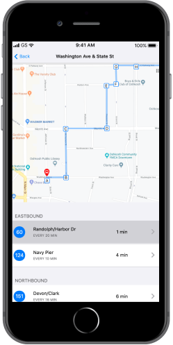
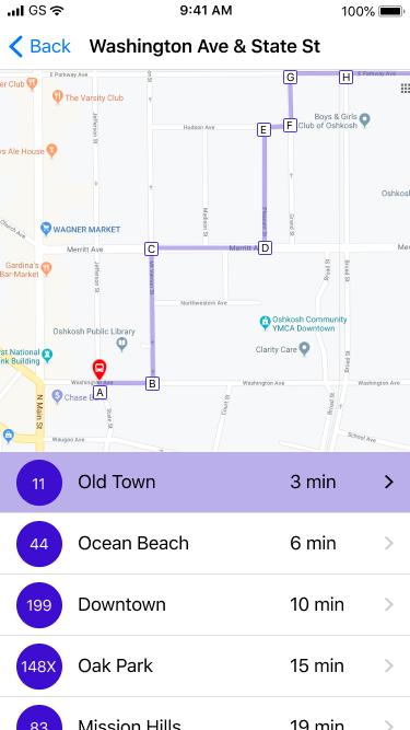
I took what I learned from user testing and created a mockup for the BusyBus route screen. The screen includes a map with the route showing and each stop marked, and a list of upcoming routes in order of arrival with the top route selected by default. The mockup was designed to be in line with Apple’s Human Interface Guidelines, and to be clean and accessible with intuitive features. I matched the background color of the selected route with the route on the map, included arrows so the user would know there is another screen, and pushed the last list item partly off screen to imply scrolling.
Final prototype
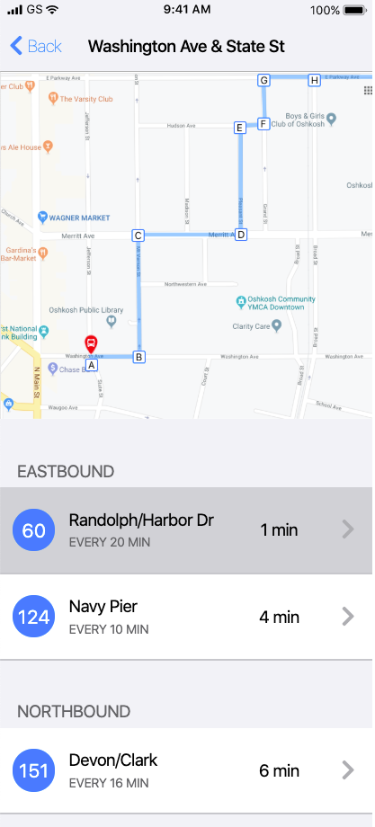
Coding my final prototype was the last step. I created a list view for the bus routes screen, containing a map with the route and stops marked and a list of upcoming routes in order of arrival with the top route selected. For my final iteration I changed the color of the highlighted route to be more in line with Apple’s Human Interface Guidelines. I kept the simple design features from my mockup, where the map takes up the top portion of the screen and the bottom portion is scrollable. I made the routes hoverable, with the top route selected by default, and have the routes sorted by direction. Lastly, I added the route frequency so users can think ahead as they plan their commute.
Conclusion
BusyBus was an exercise in understanding the design process and its contributory components. I designed a prototype to solve the problems of congested bus stops in an expanding transit system, and learned some lessons along the way. I gained experience breaking down a problem and targeting specific actions to produce a solution. I practiced the patience and problem-solving skills needed to precisely code a visual design mockup. I learned to be deliberate in each step, yet welcome feedback and iterate accordingly. In the future I will remember these lessons and bring them forward in projects to come.
Roles
User research
Information architecture
Visual design
Usability testing
Mockup iteration
Frontend development
Deliverables
User surveys
Competitive analysis
User stories
Paper prototype
High fidelity mockups
Tools
Figma
Marvel
Google Sheets
Google Forms
See more projects
Chord Health helps patients with musculoskeletal conditions understand and manage risk factors for chronic pain through a mobile app.
See case studyFurward takes the stress off of pet owners and their pets with a platform where neighbors can exchange pet care for free.
See case studyCamelot offers a cloud storage solution for users who need to store and send large amounts of data in a secure and simple interface.
See case study